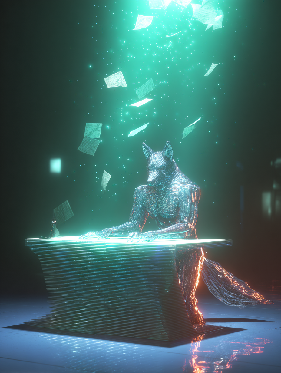
From a real client brief to a working website prototype, here’s how I used AI, visual references, and Claude Code to dramatically accelerate the process of creating and presenting a digital concept.
What if you could take a real client’s website brief, analyse their business requirements, explore different creative directions, and build a working, interactive website concept in less than 30 minutes?
That’s exactly what I wanted to test when I came across an interesting website redesign opportunity from Valocity, a global PropTech and FinTech company.
Instead of preparing a conventional proposal filled with examples of previous work and descriptions of what I could potentially deliver, I decided to use AI to create something more tangible: a working website concept that the prospective client could actually explore.
Using ChatGPT for research, content structuring, and creative direction, followed by Claude Code for website implementation, I developed an interactive prototype with a complete homepage, animated visualisations, product interface concepts, and a premium visual identity.
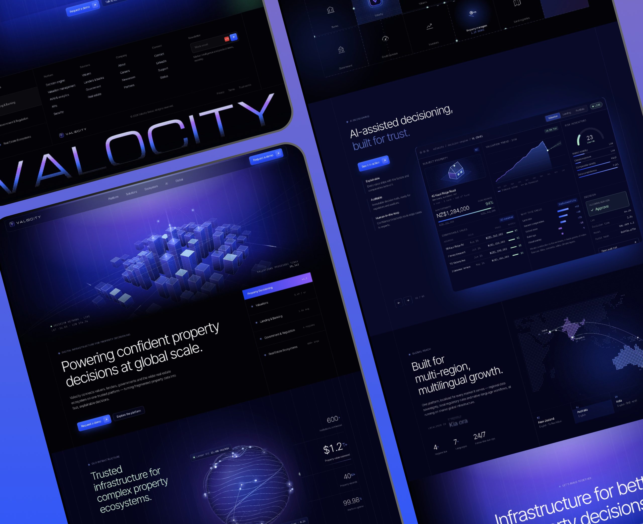
The most interesting part wasn’t the speed itself, but how dramatically AI shortened the distance between understanding a business problem and demonstrating a possible solution.
Watch the full YouTube walkthrough: https://youtu.be/u-RUcayVwaE
Explore the working website concept: https://valocity-six.vercel.app/
The Experiment: Can AI Replace Days of Initial Website Prototyping?
Valocity was looking for a partner to redesign and rebuild its website, with requirements including enterprise-level design, interactive data visualisation, motion graphics, multilingual capabilities, third-party integrations, and a content management system that its marketing team could maintain independently.
The company also faced an interesting positioning challenge: it wanted to move away from being perceived as simply a provider of property valuation software and instead communicate its role as digital infrastructure for property decisioning.
In practical terms, the new website needed to help senior decision-makers at banks, governments, and financial institutions understand how Valocity connects property information, technology, organisations, and workflows.
The brief specifically challenged designers to communicate that infrastructure positioning within the first 15 seconds of visiting the website.
Traditionally, responding to this opportunity might involve several distinct stages of work, including business research, competitor analysis, visual research, wireframing, UI design, prototyping, and frontend development.
Although each stage serves a purpose, much of the time involved comes from translating information and creative decisions between different tools and formats.
I wanted to explore whether AI could compress those early stages into a single workflow without losing the strategic thinking that makes the result useful.
Importantly, the objective wasn’t to build a production-ready enterprise website in 30 minutes, which would be unrealistic given the technical requirements, but to produce a convincing interactive concept that could demonstrate a proposed creative direction.
Step 1: Use ChatGPT to Turn the Client Brief Into Clear Design Requirements
The first step was understanding what the client actually needed, rather than immediately asking AI to generate a website.
I provided ChatGPT with the original Dribbble project brief and used it to break down the company’s requirements, business objectives, target audience, and creative expectations.
This helped separate the technical requirements from the positioning challenge that the website needed to solve.
For example, features such as multilingual content management, HubSpot integration, accessibility compliance, and technical SEO were necessary for the final implementation, but they weren’t the most important elements to demonstrate in an initial creative concept.
The more immediate challenge was showing how the website could communicate infrastructure, intelligence, connectivity, and scale.
From that analysis, I established several practical objectives for the prototype:
- Communicate Valocity’s infrastructure positioning immediately through the homepage hero.
- Replace conventional real estate imagery with visualisations of digital systems, networks, and information flows.
- Present the company’s different solutions as parts of a connected platform.
- Demonstrate how an interactive ecosystem could explain relationships between banks, governments, valuers, and other stakeholders.
- Explore how an AI-assisted decisioning experience might be communicated through a product interface.
- Maintain the visual sophistication expected from an enterprise financial technology company.
This gave the project a much clearer foundation than a generic instruction such as “create a modern FinTech website.”
Why This Step Matters
One of the easiest mistakes to make with AI website builders and coding agents is jumping directly into implementation without establishing what the website is supposed to achieve.
AI can produce visually sophisticated layouts very quickly, but a polished interface is of limited value when it fails to communicate the underlying business proposition.
By using ChatGPT to organise the brief first, I could approach the project with a clearer understanding of the intended outcome and then use Claude Code to execute that direction.
Step 2: Research Visual References Instead of Generating Random Designs
Once I understood the business challenge, I explored several existing websites that represented different approaches to presenting complex products and services.
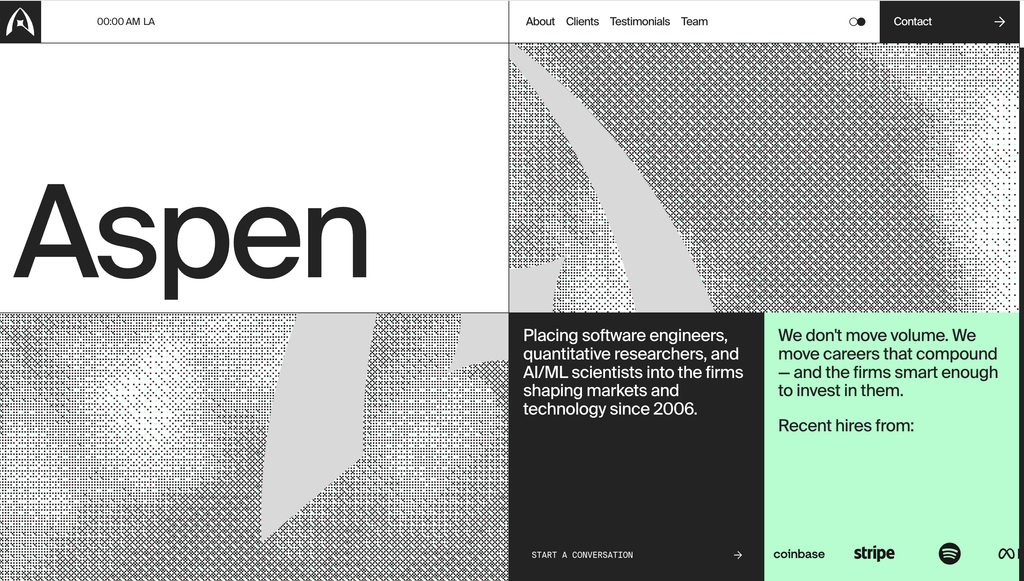
The three references I used for the creative exploration were Blink Capital, Orchid, and Aspen Search.
Each offered a different visual approach that could potentially work for Valocity.
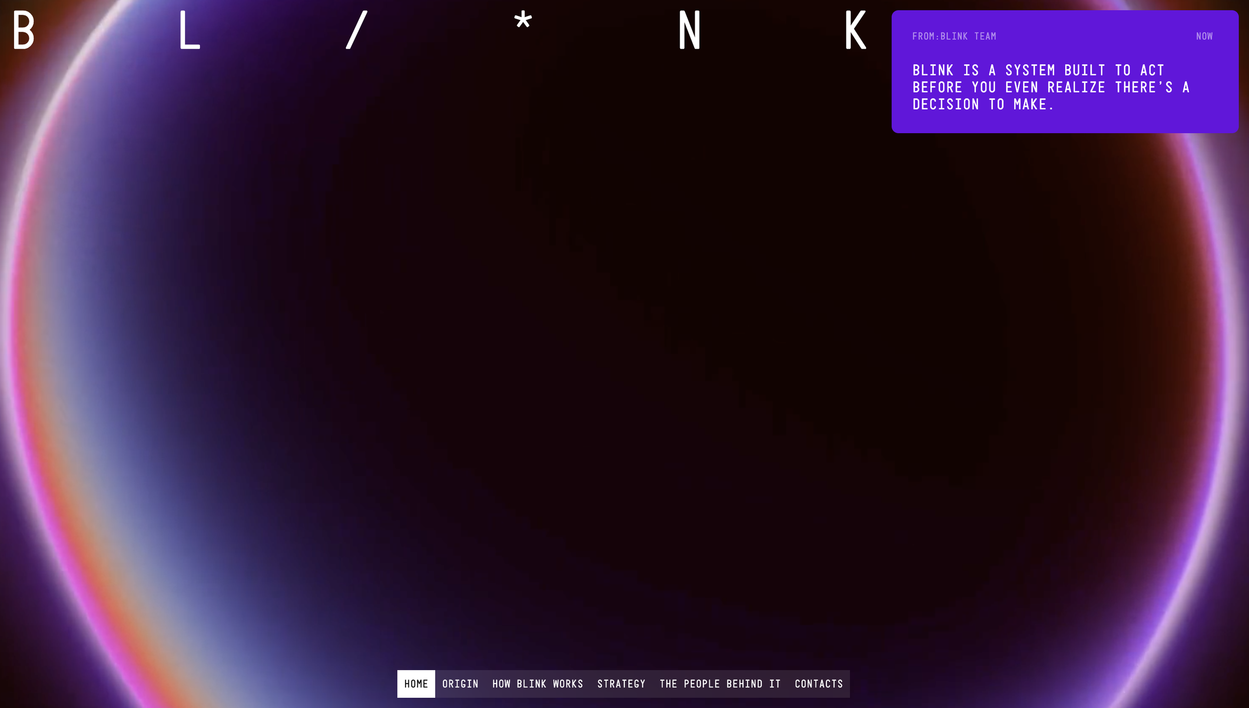
Blink Capital: Bold and experimental
This direction demonstrated how expressive typography, strong contrast, and unusual compositions could create a distinctive digital identity without following the familiar structure of a generic corporate website.
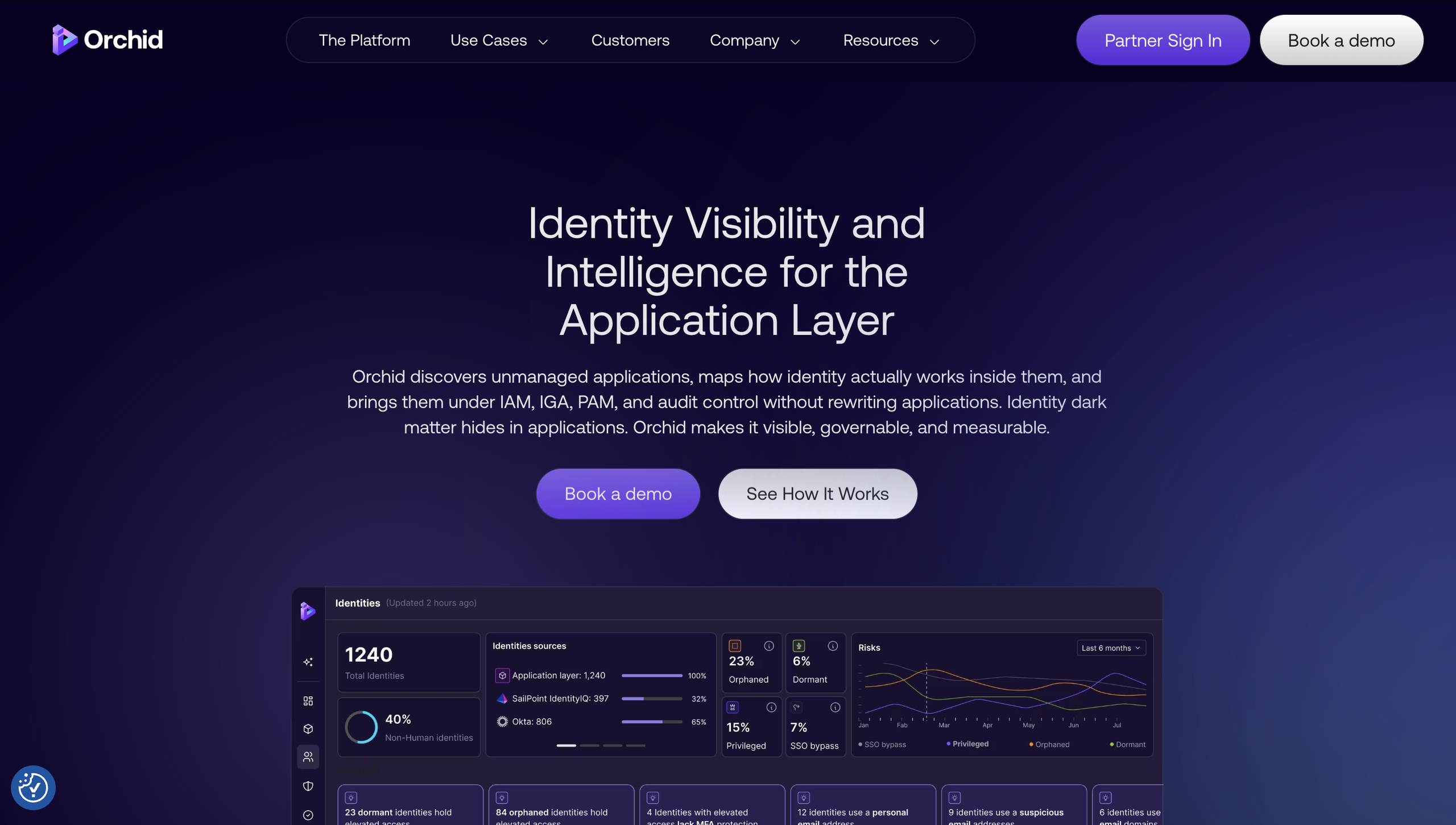
Orchid: Futuristic and technology-driven
Orchid provided inspiration for communicating complex digital systems through darker interfaces, atmospheric gradients, visual depth, and immersive technological illustrations.
Aspen Search: Minimal and editorial
This direction demonstrated how disciplined typography, generous whitespace, and carefully structured layouts could communicate sophistication while keeping complex information approachable.
Rather than selecting one website and asking AI to reproduce it, I wanted to understand which characteristics could be combined into a suitable direction for Valocity.
I also explored visual references for the color palette, lighting, layout composition, and page structure, giving Claude Code a more concrete understanding of the intended aesthetic.
A Useful Prompting Principle: Separate Visual Style From Website Structure
One particularly useful lesson from this experiment was that AI responds more effectively when visual references are assigned distinct responsibilities.
Instead of saying “make a website that looks like these examples,” it’s more useful to specify which reference should influence which aspect of the design.
For example:
Reference A — Visual identity: Use this reference for its color palette, typography, gradients, lighting, and general visual atmosphere.
Reference B — Layout: Use this reference for its section structure, spacing, page composition, and relationship between content and visuals.
Reference C — Business requirements: Use the client’s brief to establish the content, positioning, and experience the website needs to communicate.
This approach gives the coding agent clearer instructions while reducing the risk of producing a confused combination of unrelated styles.
It also gives the person directing the project greater control over the result, because each reference contributes something specific rather than becoming a template to copy.
Step 3: Use Claude Code to Translate the Direction Into a Working Website
With the requirements and references established, I moved into Claude Code to build the actual website concept.
The instructions focused on three things: the visual direction, the content structure, and the interactions that would make the experience feel like a functioning enterprise website rather than a static mockup.
I wanted Claude Code to develop a responsive landing page with a sophisticated technological aesthetic, using deep navy backgrounds, electric blue and violet gradients, large typography, atmospheric lighting, and animated visual elements.
The overall page structure followed the intended storytelling sequence, starting with the company’s infrastructure positioning before introducing the platform, solutions, ecosystem, AI decisioning experience, and global presence.
Keep the Prompt Clear and Focused
A useful discovery was that the implementation prompt didn’t need to become an enormous technical specification.
For a rapid creative prototype, the most important instructions were the ones that established exactly what should be built and how closely the output should follow the supplied visual references.
A simplified version of the approach would look something like this:
Example Claude Code instruction:
“Build a complete, responsive landing page for Valocity, a global PropTech and FinTech company providing digital infrastructure for property decisioning.
Study the visual references I’ve provided before starting.
Use the first reference for its visual identity, including colors, typography, gradients, and lighting. Use the second reference for the overall landing-page structure, spacing, and section composition.
Create a premium enterprise technology experience with an animated infrastructure hero, connected ecosystem visualisation, solution cards, conceptual AI decisioning interface, and global network section.
Avoid generic real estate imagery and standard SaaS templates.
Prioritise visual quality, responsive design, smooth animations, and functional interactions.
Build the actual website rather than providing a plan or static mockup, then run the project and refine the result.”
The exact implementation instructions will vary depending on the project, but the principle remains the same: give the AI enough direction to make useful decisions without overwhelming the initial prototype with requirements that aren’t relevant yet.
For this project, the goal was a visually convincing concept, not the complete production architecture.
Step 4: Build Visualisations That Explain the Business
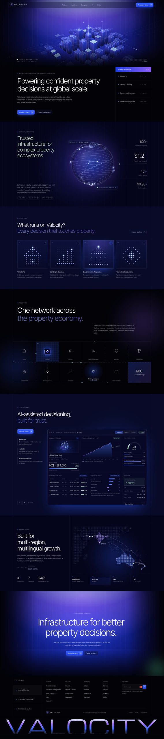
The resulting Valocity concept includes several sections that demonstrate how interactive design can help communicate otherwise abstract technological capabilities.
Infrastructure Hero
The opening section introduces Valocity’s positioning through a large headline supported by a dimensional infrastructure visualisation.
Rather than relying on a photograph of a building, the concept uses layered geometry, luminous connections, and visual depth to suggest information flowing through an interconnected technology platform.
The objective was to communicate the idea of infrastructure immediately, even before visitors had read the full explanation.
Connected Infrastructure Visualisation
A large digital sphere reinforces the concept of connectivity, scale, and information movement.
This serves as a visual focal point while supporting the broader narrative that Valocity connects different parts of the property economy.
Solutions and Ecosystem
The website includes sections dedicated to valuations, banking and lending, government and regulation, and real estate ecosystems.
These are presented as related applications of a broader platform rather than isolated products.
The ecosystem section further explores how institutions, data providers, and property professionals might be represented within a connected digital environment.
AI Decisioning Interface
One of the more interesting elements is a conceptual AI decisioning dashboard featuring property information, market signals, analytics, and decision-support indicators.
Instead of simply stating that the company uses advanced technology, this section explores how an interface could help visitors understand the relationship between data and decision-making.
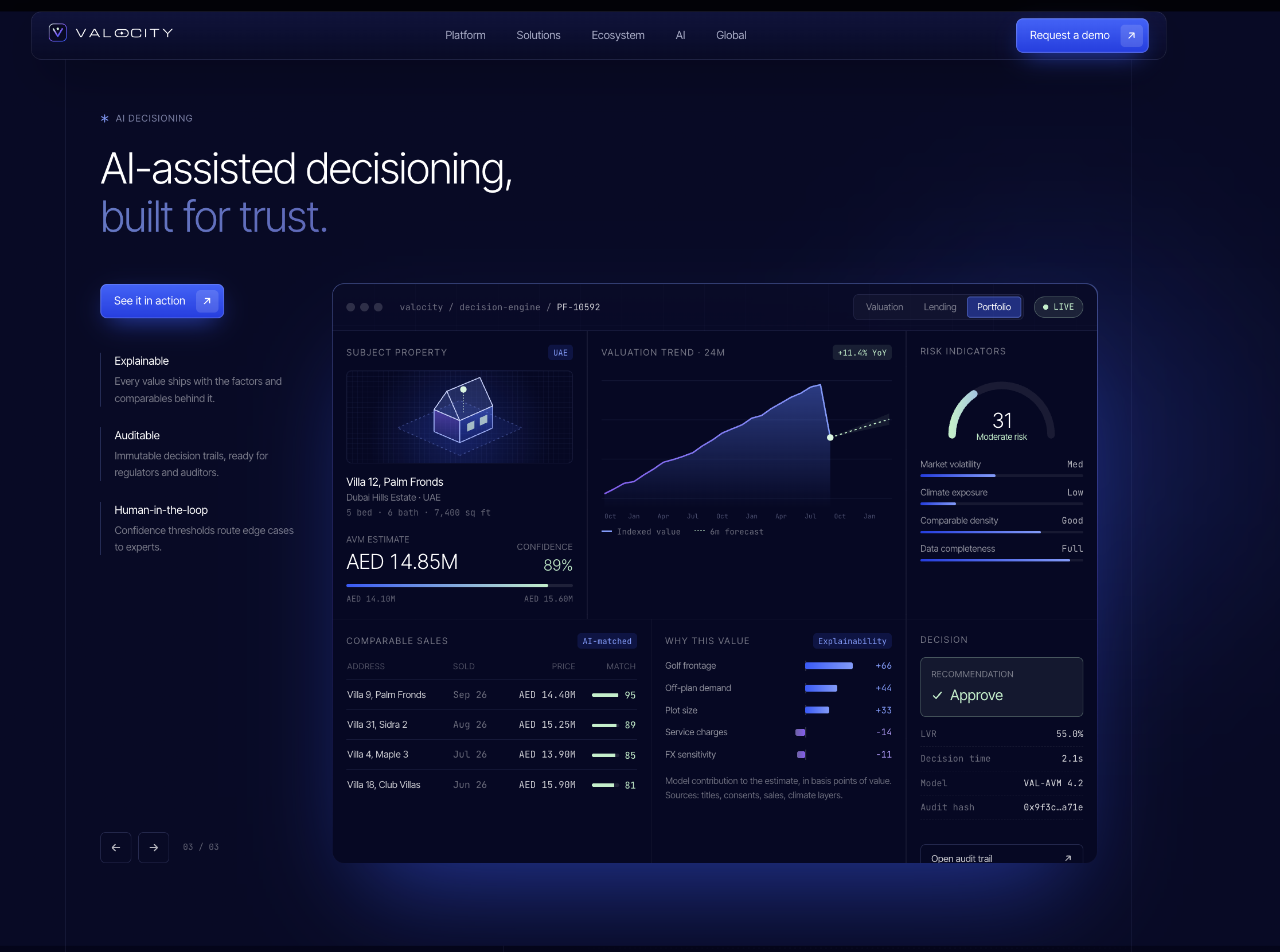
It’s important to note that this is an illustrative UI concept rather than a representation of Valocity’s verified proprietary software.
Global Network
Finally, the website includes a geographical visualisation highlighting the company’s presence across New Zealand, Australia, India, and the UAE.
Together, these elements turn the landing page into a more complete explanation of the business rather than a conventional collection of marketing sections.
Explore the result: https://valocity-six.vercel.app/
Step 5: Turn the Prototype Into a Client Pitch
Once I had a working website concept, I could present it alongside the original creative references.
This changed the presentation considerably, because instead of simply describing how I would approach Valocity’s website, I could introduce several possible visual directions and then demonstrate how I had interpreted those ideas for the company itself.
The presentation followed a straightforward structure, beginning with the three creative references before introducing the fourth direction: the interactive Valocity prototype.
The client could explore the website directly, evaluate the proposed visual direction, and consider how the experience might support the positioning outlined in the brief.
I also recorded the walkthrough to make the presentation accessible without requiring a live meeting.
Watch the client-facing creative presentation:
This approach doesn’t eliminate the need for a proper commercial proposal, project scope, or implementation plan, but it provides something much more concrete to discuss during the early stages of a potential engagement.
For freelancers, agencies, and small creative teams, this can be a useful way to demonstrate capabilities when competing for projects that place significant emphasis on creative thinking and execution.
What AI Accelerated, and What It Didn’t
One important distinction is that building an interactive website concept isn’t the same as delivering a complete enterprise website.
Valocity’s original requirements included multilingual support, CMS capabilities, integrations with external business systems, technical SEO, accessibility compliance, and ongoing operational support.
Those requirements would still involve careful implementation, testing, technical planning, and collaboration with the client.
The 30-minute experiment focused on the initial creative concept and prototype, not the complete development and launch process.
What AI accelerated was the transition between analysing the brief, establishing the direction, creating the design, and implementing an experience that could be demonstrated in a browser.
Previously, those activities might have involved preparing several static designs and then spending additional time converting them into a functioning prototype.
With Claude Code, much of that initial implementation could happen directly from structured instructions and references.
This makes AI particularly useful for early-stage validation, where the objective is to explore an idea and evaluate whether the proposed approach makes sense before committing to a larger investment.
How You Can Apply This Workflow to Your Own Projects
The same approach can be adapted beyond website redesign pitches, particularly when you need to demonstrate an idea quickly without building the entire final product.
For example, a startup founder could use it to explore how a product might be presented to investors, while a small business could test several website directions before committing to a complete redesign.
An agency could use the process to develop interactive concepts for a client presentation, and a product team could explore different interfaces before starting a longer development cycle.
The essential workflow remains consistent:
- Understand the problem. Use ChatGPT to identify the objective, audience, requirements, and most important communication challenges.
- Collect relevant references. Choose examples that demonstrate specific characteristics you want to explore, such as typography, interactions, layout, or visual identity.
- Define the direction. Explain which references influence which aspects of the design, and make sure the content is grounded in the actual business problem.
- Build with Claude Code. Provide the requirements and references, instruct the tool to produce a functioning prototype, and review the result in a browser.
- Refine and demonstrate. Evaluate the quality of the interface, correct anything that doesn’t communicate the intended idea, and share the working prototype with the people who need to make a decision.
The key is to treat AI as part of a controlled workflow rather than expecting a single prompt to solve every strategic, visual, and technical challenge automatically.
Final Thoughts: AI Makes Ideas Easier to Test, Not Automatically Better
The biggest takeaway from this experiment is that tools such as ChatGPT and Claude Code are changing how quickly we can translate ideas into tangible experiences.
A creative direction that might previously have required multiple rounds of design and development can now be explored through a functioning prototype within a much shorter period.
That creates opportunities for entrepreneurs, designers, developers, and small businesses to test ideas before committing significant resources to full implementation.
However, the quality of the result still depends on understanding the problem, selecting appropriate references, communicating clear instructions, and evaluating whether the finished experience achieves its purpose.
AI can help produce the website, but it doesn’t automatically determine whether the website communicates the right message.
The real advantage is being able to move from an idea to something testable while there’s still time to question, improve, or completely change the direction.
And for anyone who regularly needs to communicate new concepts, pitch digital projects, or experiment with product ideas, that’s an incredibly useful capability.
Watch the Full Experiment and Explore the Website
Full YouTube tutorial and behind-the-scenes walkthrough:
Live interactive Valocity website concept:
https://valocity-six.vercel.app
Client-facing creative direction presentation:
https://www.berrycast.com/conversations/1b464851-2ebd-5e7e-92da-1d8bcb410b2a
Brand strategy and deep-tech design projects:
Pitch decks and presentation design:
The Valocity website is an independent creative concept developed for a prospective client pitch, not an officially commissioned or production-ready website. The interactive interfaces are illustrative demonstrations and do not represent verified Valocity product features.
If you’re experimenting with AI-assisted website development or have started using Claude Code in your own projects, I’d be interested to hear how it has changed your workflow and which parts of the process still require the most manual effort.