Most “brand exploration” is expensive hesitation.
It looks responsible on paper—workshops, moodboards, “a few directions,” stakeholder alignment. In reality it’s often a polite way to delay the moment where someone has to decide what the brand actually is. You end up paying for process when what you needed was a point of view.
In a 15–30 minute sprint, we built a complete pitch concept for an interior design studio: STRATA. Not a moodboard. Not a list of adjectives. A coherent direction you could put in front of a client and let them react to something real.
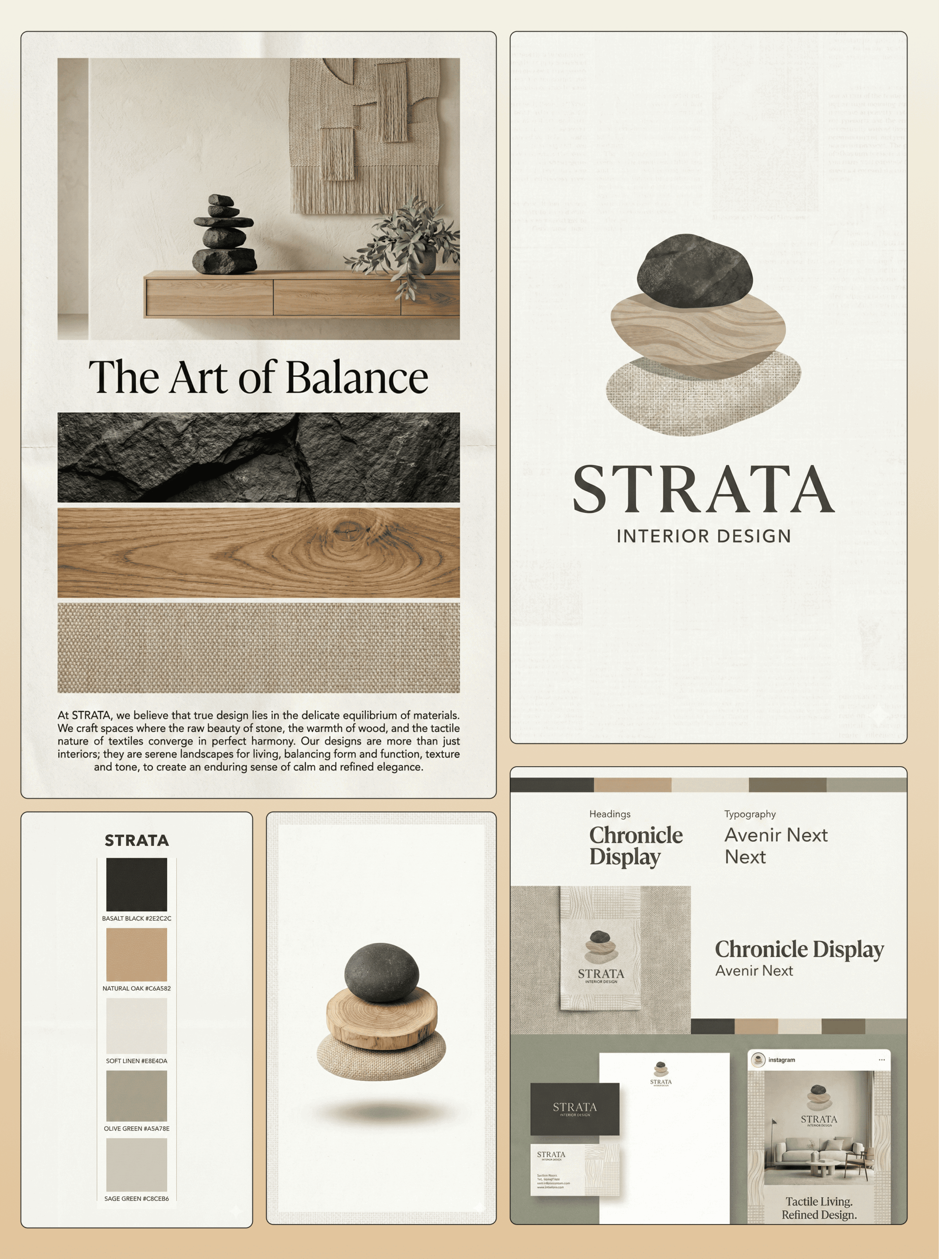
STRATA’s hook was simple: the identity is literally made from materials. The mark stacks three tactile layers—basalt stone, light oak, woven linen—because that’s what the studio trades in: surfaces, weight, texture, restraint. It’s not “inspired by” interiors. It behaves like interiors. The logo is an object. It has mass. It has grain. It has texture. And the moment you see it, you already know the kind of spaces STRATA designs: calm, considered, expensive in the quiet way.
The rest of the system supports the same story without shouting. Linen white and sage tones keep it composed. Basalt/charcoal anchors it. Oak adds warmth without turning it rustic. The typography pairing reads editorial—confident hierarchy, clean spacing, no trend-chasing quirks. Then we pushed it into context with a newspaper-style full-spread ad layout, because brands don’t live as isolated marks. They live in layouts. In compositions. In how they hold whitespace. In how they look when they have to sell an idea in one page.
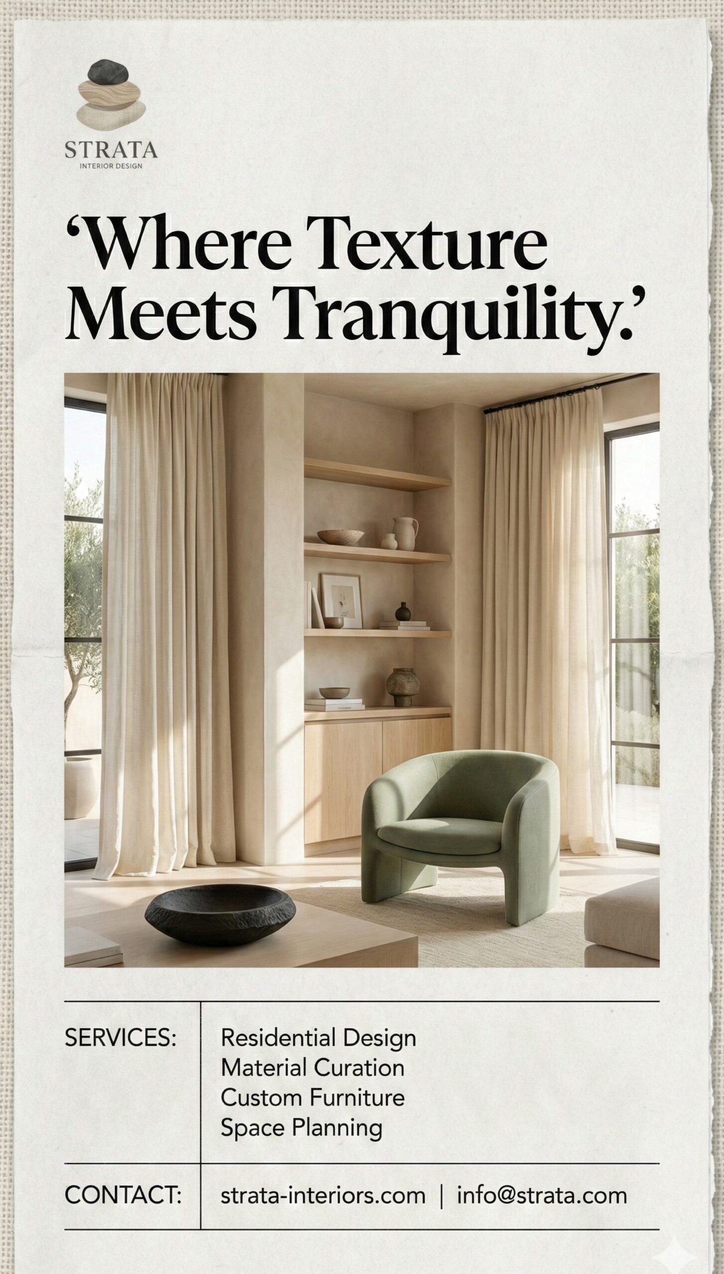
That’s the part most “exploration” forgets: clients don’t approve concepts, they approve proof. They approve what they can picture existing. The newspaper ad layout makes STRATA feel like it’s already in the world—already communicating, already coherent, already ready for a client’s attention.
None of that happens by “typing instructions.” It happens because the prompt framed the work like a senior creative brief. The prompt didn’t ask for “a nice logo.” It demanded a material-led symbol with a clear concept. It forced consistent textures. It specified composition rules—whitespace, grid, hierarchy—so the output couldn’t wander. It anchored the aesthetic to editorial print instead of letting the work drift into whatever is trending this week. And it kept everything aligned by repeating the same constraints across every output: the mark, the palette, the ad layout, the mockups.
That’s leverage. Not speed for its own sake—control.
Because early agency exploration phases usually run like this: ten directions, three meetings, twenty opinions, and two weeks spent arguing about what “premium” means. You don’t get clarity, you get exhaustion. And exhaustion doesn’t create good brands. It creates safe ones.
With STRATA, there’s a single direction expressed across multiple touchpoints. You can judge it fast: does the idea hold? Does it feel inevitable? Does it match the market you want to win? If yes, you move to refinement. If no, you kill it early—cheaply—without sinking time into endless “maybe.”
For founders and teams, this changes the first week of work. Instead of hiring exploration and hoping clarity appears, you start with clarity and only pay for refinement. Instead of meetings to “find the vibe,” you get a direction that either holds up or collapses fast. That’s the point: speed isn’t the flex. Decision compression is.
And once decisions compress, everything else follows: the deck gets sharper, the pitch gets cleaner, and the brand stops being a discussion topic and starts being a tool.
INTERIOR DESIGN LOGO PROMPT (PREMIUM / MATERIAL-LED)
Create a premium interior design studio logo concept based on a material-led “layers” idea. The logo mark must be a minimal stacked symbol made from three tactile layers (choose materials that fit a high-end interior studio). Example structure: stone + wood + fabric.
Style rules: calm, refined, architectural; no house icons, no furniture icons, no leaves. Keep shapes organic and simple with soft shadows and realistic but restrained textures (no repeating patterns, no heavy noise).
Color palette direction: a calm neutral base plus one muted accent (examples: linen/off-white + charcoal + oak warmth + muted sage/olive).
Typography feel (for presentation context): editorial, confident hierarchy (classic serif for headlines + clean sans for labels/body, or close equivalents).
Output requirements:
- Centered logo lockup on a clean light background with subtle paper grain
- Monochrome version (single ink on light background)
- Icon-only version of the mark
- A simple brand sheet showing palette swatches + typography feel
- Composition must use generous whitespace and a clean grid; overall look should feel like a premium studio identity system, not a trendy startup.
FAQ
What is an interior design logo prompt?
A prompt that acts like a creative brief—telling the generator the concept, style rules, and constraints so the output looks intentional.
What should an interior design logo avoid?
Literal house icons, generic furniture silhouettes, random “luxury” flourishes, and trendy effects that date fast.
What makes a logo feel premium for interiors?
Restraint: calm palette, strong spacing, tactile cues, and a system that works across applications.
Should I ask for multiple directions in one prompt?
No. One strong direction beats five weak ones. Generate variations within one concept.
How do I keep results consistent across outputs?
Repeat the same constraints: composition, materials, palette, typography feel, whitespace, and grid.
Can this prompt produce more than a logo?
Yes—if you include palette, type feel, and layout rules so the identity behaves consistently.