
Can you create a complete brand identity with AI, or are you just generating a logo and calling it a brand?
There’s a fairly big difference.
An AI logo generator can produce hundreds of attractive symbols. Some will even come with matching colors, business cards, and social media templates.
But that doesn’t mean you’ve developed an identity that communicates what your business stands for, differentiates it from competitors, or works consistently across a website, product, and marketing materials.
To demonstrate the difference, I’m using FORMA, an independent fintech brand concept I developed around a simple proposition:
Money, in a better place.
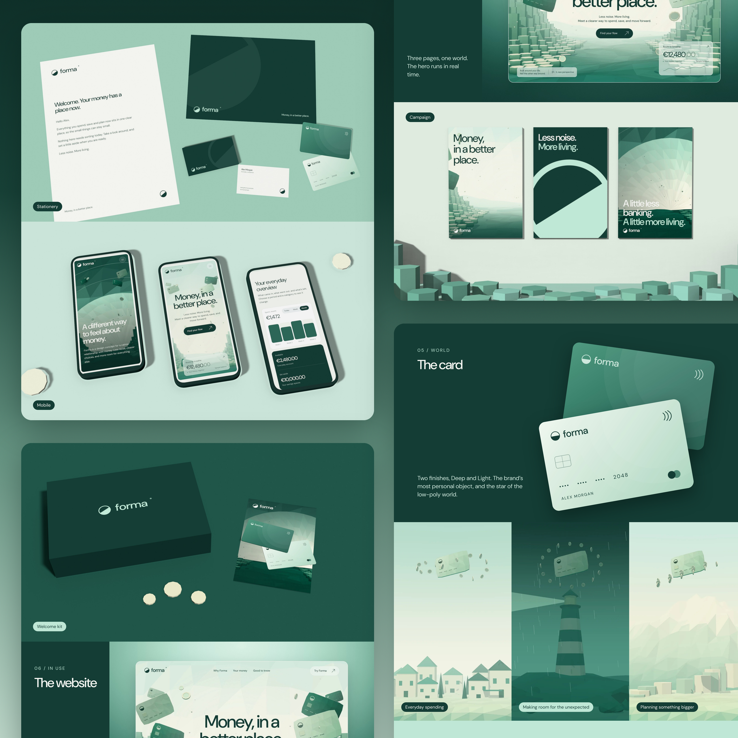
The project includes a geometric logo, color system, typography, custom low-poly illustrations, payment cards, stationery, advertising, and an interactive three-page website.
It’s a useful reference for understanding what a complete identity requires and how AI can help small businesses create one.
This isn’t a claim that every element of FORMA was automatically generated. The project is an original design concept, and the workflow below explains how to apply AI-assisted methods to similar work.
The important question isn’t whether AI can generate attractive images.
It’s whether you can turn those outputs into a recognizable, practical system that represents your business.
1. Start With Brand Strategy, Not an AI Logo Generator
One of the easiest ways to waste time with AI branding tools is to begin with a prompt like:
“Create a modern, professional logo for a fintech company.”
You’ll get something.
Probably several somethings.
And they may look perfectly respectable.
But the AI has no meaningful information about the business, its customers, its competitors, or what makes it different.
The first step should be developing a clear creative brief.
What You Need to Define
Before you create a logo, establish five things:
- Audience: Who does the business serve, and what matters to those customers?
- Positioning: What makes the business different from existing alternatives?
- Personality: Should it feel confident, approachable, technical, premium, playful, or something else?
- Core message: What should people remember after encountering the business?
- Applications: Where will the identity actually appear?
For FORMA, the starting point was the frustration people experience when managing everyday finances.
The concept was built around three principles:
Fewer steps. Reduce unnecessary complexity.
One clear view. Bring spending, saving, and planning together.
Room to change your mind. Allow financial goals to evolve.
Those ideas informed the logo, visual system, brand voice, and proposed product experience.
Without that foundation, the project could easily have become another generic banking identity.
AI Prompt 1: Create a Brand Positioning Brief
Use this prompt before opening a logo maker or design platform.
Act as an experienced brand strategist. Help me develop a creative brief for a business with the following details:
Business: [description]
Target audience: [audience]
Product or service: [offering]
Competitors: [names]
Customer problem: [problem]
Desired perception: [personality]
Identify the primary customer need, potential differentiation, brand positioning, three personality traits, key messages, and five directions we should avoid.
Separate assumptions from verified information. Ask questions where important details are missing. Do not suggest logo concepts yet.
The output shouldn’t be treated as a finished strategy.
Review it against customer research, competitors, and your business requirements.
AI can help organize thinking. It cannot independently establish that your positioning is commercially correct.
2. Use AI to Create Logo Concepts, Then Refine Them
Once the positioning is defined, you can begin exploring the visual identity.
This is where AI logo generation becomes useful.
An AI logo maker can quickly produce variations based on geometric shapes, typography, abstract symbols, and industry references.
Some AI-powered tools can also suggest colors, layouts, and applications.
But there’s a problem.
Generating thousands of logo variations doesn’t necessarily move you closer to a distinctive result.
Sometimes it just gives you thousands of choices.
The FORMA Logo Example
FORMA uses a simple circular symbol divided diagonally, with one half filled and the other left open.
The dividing line rises at 32 degrees.
The symbol can be interpreted as both a coin and a rising sun.
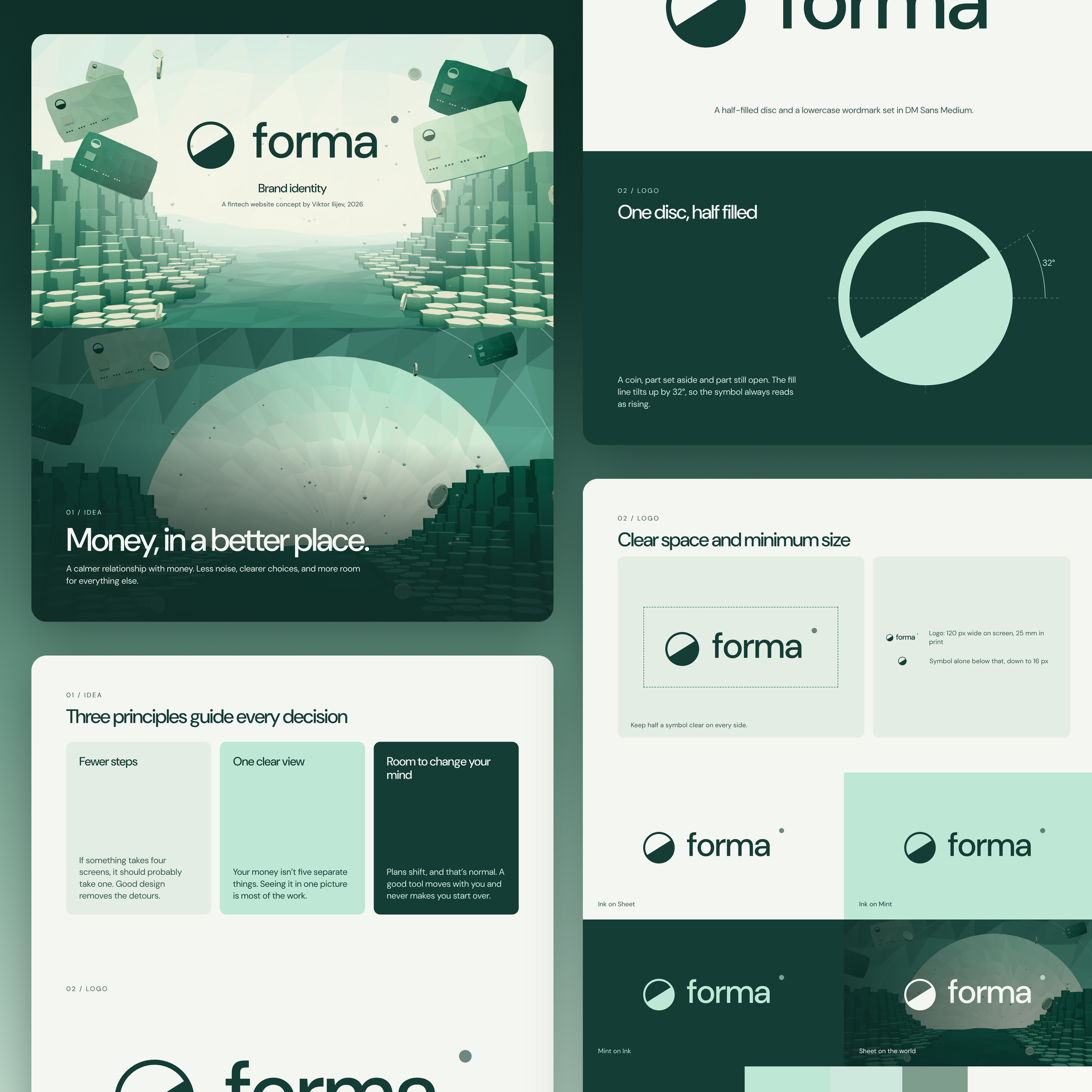
Those meanings connect to the financial category while suggesting progress and possibility.
It’s intentionally simple.
The mark also works independently from the lowercase FORMA wordmark, making it useful for cards, icons, stationery, and digital interfaces.
The important design decision wasn’t selecting an attractive circle.
It was deciding what the symbol needed to communicate and how it would function across the entire brand.
AI Prompt 2: Explore Logo Directions
Based on this approved creative brief: [insert brief], develop six conceptually different logo directions.
For each direction, explain the visual idea, connection to the positioning, possible symbolism, typography approach, and potential weaknesses.
Avoid generic industry symbols, unnecessary complexity, and imitation of existing logos.
Prioritize concepts that can work in one color, at small sizes, and across digital and printed applications.
Recommend three directions for further exploration and explain the trade-offs.
Once you’ve chosen a direction, use your preferred design tool to develop it properly.
You may use AI to create initial visual references, but the final logo should be checked for originality, legibility, geometry, and reproducibility.
If an AI tool generates a promising symbol as a raster image, that isn’t necessarily a usable logo file.
A professional identity typically requires editable vector artwork and clearly defined variations.
Don’t mistake the ability to download your logo for the completion of the design process.
What About Dedicated Logo Generators?
An AI logo generator is useful when speed and convenience are the main requirements.
Platforms such as Design.com, alongside other AI-powered logo services, operate in this category.
They can help you create logo options and supporting assets through guided generation.
However, whether a particular platform provides suitable licensing, original artwork, editable files, or sufficient customization needs to be evaluated separately.
The best AI tool depends on what you’re actually trying to accomplish.
A basic logo generator and a professional brand development workflow solve different problems.
3. Build a Complete Visual Identity With AI
Once the logo direction is established, you need to create the system around it.
This is where many businesses stop too early.
They have a symbol, two colors, and maybe a font.
But a visual identity requires more than matching colors.
At minimum, define a palette, typography rules, spacing principles, imagery direction, and component styles.
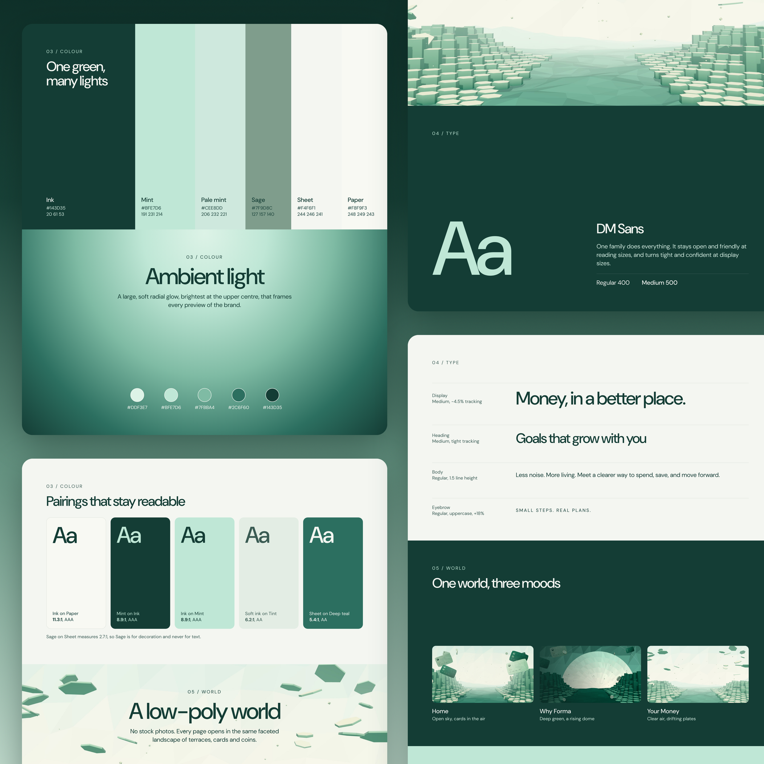
The FORMA Color System
FORMA uses six principal colors.
| Name | Hex |
|---|---|
| Ink | #143D35 |
| Mint | #BFE7D6 |
| Pale Mint | #CEE8DD |
| Sage | #7F9C8C |
| Sheet | #F4F6F1 |
| Paper | #F8F9F3 |
Green is a familiar choice for a financial brand.
The challenge was creating a distinctive expression without losing the category’s associations with money, growth, and stability.
Ink provides the darker foundation.
Mint introduces a softer character.
Sage and the lighter neutrals extend the palette into backgrounds, graphics, and interface applications.
The colors are also supported by ambient lighting and gradients, giving the identity a more atmospheric quality.
This is a good example of where AI can generate potential color combinations, but human evaluation remains essential.
You still need to check contrast, readability, accessibility, and consistency.
Typography and Hierarchy
FORMA uses DM Sans.
Rather than combining several decorative typefaces, I chose one flexible family that could support large headlines, body copy, smaller labels, and financial interfaces.
For a business trying to build a brand with AI, that kind of restraint is valuable.
You don’t need five AI-generated font combinations.
You need clear rules that work.
Define which type sizes are used, how headings relate to body text, and how typography behaves across applications.
The same principle applies to UI components.
A button, navigation label, dashboard heading, and promotional headline shouldn’t look like they belong to four separate companies.
AI Prompt 3: Develop a Cohesive Identity System
Using the approved brand positioning and logo direction, develop a visual identity specification.
Recommend a primary and secondary color palette with HEX values and intended uses.
Recommend typography for display headlines, headings, body text, and interface labels.
Define spacing, contrast, imagery, and component principles.
Explain how the system should adapt to a website, presentation, social media graphics, and printed materials.
Identify combinations that require accessibility testing.
Keep the recommendations consistent with the brand personality rather than following generic design trends.
You can then turn these recommendations into a practical specification.
The goal is a cohesive visual identity, not a collection of attractive outputs.
4. Use AI to Create a Consistent Illustration Style
This was one of the most interesting parts of developing FORMA.
Instead of stock photography or generic financial graphics, the identity uses a custom low-poly world.
The environment includes geometric landscapes, faceted surfaces, floating payment cards, and coins.
It creates an identifiable universe that can be adapted across different parts of the website and wider marketing materials.
One World, Three Visual Environments
The finished FORMA identity includes three visual treatments.
Home: Open sky and floating cards.
Why Forma: Deeper green environments with a rising dome.
Your Money: Clearer, lighter compositions with drifting geometric elements.
The environments serve different purposes, but they use a common artistic language.
That’s the real challenge when using AI to generate imagery.
An AI image generator might create a beautiful first illustration, then produce something completely unrelated when you ask for another one.
Suddenly the lighting changes, the geometry looks different, and the overall style becomes inconsistent.
To prevent that, you need a repeatable art direction.
AI Prompt 4: Build a Reusable Visual World
Create an art direction specification for a consistent brand illustration system.
Brand personality: [description]
Color palette: [HEX codes]
Visual style: [style]
Core objects: [objects]
Lighting: [description]
Materials: [description]
Composition principles: [description]
Define the characteristics that must remain constant across every illustration.
Then propose three distinct scenes that belong to the same visual universe.
For each scene, provide an image-generation prompt, a negative prompt, and a checklist for evaluating consistency.
Do not introduce new colors, materials, or illustration styles without approval.
For FORMA, an equivalent specification would emphasize low-poly geometry, controlled green lighting, floating financial objects, and restrained compositions.
Use reference images when your chosen AI platform supports them.
Keep a record of approved compositions, prompts, visual parameters, and corrections.
That makes it much easier to maintain brand consistency across future artwork.
5. Turn the Identity Into a Complete Brand Kit
A complete brand kit should make it easier to produce new materials without reinventing the identity.
This is different from downloading a collection of generated mockups.
For FORMA, the applications include business cards, stationery, welcome kits, payment cards, advertising artwork, mobile interfaces, and a website.
Each application tests whether the identity works outside its original presentation.
What Should Be Included?
A practical package should contain:
- Approved logo variations and editable logo files.
- Primary and secondary colors.
- Typography specifications.
- Icon and illustration styles.
- Approved image assets.
- Social media and presentation layouts.
- Print and digital application examples.
- Logo spacing and minimum-size rules.
- Written brand guidelines.
- Licensing and ownership documentation for applicable assets.
An AI brand kit may provide some of these elements automatically.
But completeness isn’t just about file quantity.
A complete brand identity also needs to explain how the elements should be used together.
For example, which logo appears on a dark background? How much space should surround it? Which color combinations are acceptable? When should the illustrated world appear, and when should the layout remain minimal?
Those decisions are what turn a folder of files into a brand system.
AI Prompt 5: Audit the Complete Brand
Act as a senior brand designer reviewing a proposed identity before client handoff.
Here are the approved materials: [attach or describe assets].
Evaluate logo consistency, color usage, typography, imagery, visual hierarchy, and application quality.
Identify inconsistencies between website, social media, stationery, presentations, and product interfaces.
Separate critical problems from optional improvements.
List any missing files, specifications, or usage rules required for professional handoff.
Do not assume the presence of an asset unless it has been supplied.
Return a prioritized checklist for completing the identity.
This kind of review is particularly valuable when multiple AI systems have contributed to the project.
One tool may suggest a color palette while another produces website layouts, and a third generates illustrations.
Without a shared reference, the outputs can drift apart.
6. Create Brand Guidelines That AI Tools Can Actually Follow
Traditional brand books often document the logo, colors, typography, and approved applications.
Those rules remain important.
But when businesses use AI regularly, they also need instructions that can be reused across different systems.
For example, an AI writing assistant needs the brand voice, preferred terminology, audience, and messaging principles.
An image generator needs the palette, illustration style, composition rules, and reference assets.
An AI website tool needs components, typography, spacing, and interaction guidelines.
These are different requirements.
A single generic instruction saying “make everything match our brand” isn’t enough.
A useful brand book should specify what matching actually means.
The same rules can then be translated into instructions for different AI platforms.
This is also where brand management becomes important.
You need an approved reference rather than allowing every AI system to invent a slightly different version of the identity.
I’ve covered this process in more detail in AI Brand Guidelines: A Template Your Team Can Use.
For teams that use multiple AI systems, that guide complements the identity-creation process described here.
7. Which AI Branding Tools Should You Use in 2026?
There’s no single best AI platform for every stage of identity creation.
The more useful approach is to choose tools according to their responsibilities.
| Task | Appropriate tool category |
|---|---|
| Research and positioning | AI assistant with source review |
| Logo exploration | AI logo generator or image generation tool |
| Logo refinement | Vector editing tools |
| Color and typography | Design platform with manual review |
| Custom illustration | AI image generation |
| Brand guidelines | Document and design tools |
| Website and product UI | Design and development environment |
| Consistency checks | AI assistant plus human review |
Tools such as ChatGPT can help organize a creative brief, explore positioning, prepare image prompts, and evaluate written guidelines.
Figma can be used to develop and document the approved design system.
Adobe Illustrator or comparable editing tools can support precise vector artwork.
AI-powered design platforms can assist with asset generation and experimentation.
But using more tools doesn’t automatically create a better identity.
Every additional tool introduces another opportunity for inconsistency.
The objective is to create a practical workflow with clear approvals.
A small business doesn’t need a complicated stack simply because AI makes experimentation easy.
8. Common Mistakes When Creating a Brand With AI
Mistake 1: Accepting the First Attractive Logo
A professional-looking symbol isn’t necessarily appropriate for the business.
Check its meaning, differentiation, practical use, and potential similarity to existing marks.
Mistake 2: Generating the Entire Identity in One Prompt
Asking AI to create a complete brand in one attempt may produce something visually coherent.
But you lose control over the reasoning behind individual decisions.
Break the work into stages, review the output, and approve each part before moving forward.
Mistake 3: Confusing Mockups With Deliverables
An attractive business card mockup doesn’t mean you have a print-ready business card.
Likewise, a logo on a branded box doesn’t mean the packaging files exist.
Check what can actually be edited, produced, and handed over.
Mistake 4: Ignoring Originality and Licensing
AI-generated assets can raise questions about ownership, similarity, trademarks, and commercial usage.
Check the terms of the tools being used.
For important commercial identities, conduct appropriate trademark and originality checks before launch.
Mistake 5: Forgetting the Actual Customer Experience
An identity might look excellent on Behance while performing poorly inside a product.
A financial application needs legible information, understandable controls, and reliable feedback.
No amount of beautiful illustration compensates for an unusable interface.
Mistake 6: Letting Every AI Tool Redefine the Brand
A consistent identity depends on shared rules.
If every tool independently selects the colors, fonts, and imagery, the business ends up with unrelated outputs.
Establish approved assets and use those as the source of truth.
9. What FORMA Demonstrates About AI-Assisted Branding
FORMA provides a useful benchmark because the identity extends beyond the logo.
The geometric symbol introduces the idea of progress.
The green palette creates a calm atmosphere.
The typography supports readability.
The low-poly illustrations give the company a distinctive visual world.
And the applications show how that identity behaves across different environments.
The interactive website provides an additional test.
It demonstrates how the same visual system can support promotional content, payment card interfaces, financial dashboards, and savings planning.
For a small business, the relevant lesson isn’t to copy FORMA’s aesthetic.
It’s to follow a structured process.
Define what the business stands for.
Develop a recognizable visual direction.
Establish rules.
Apply them consistently.
And test the result in the situations where customers will actually encounter the business.
AI can make that process more accessible, especially during research, experimentation, and early production.
But it shouldn’t eliminate the evaluation and refinement that make an identity commercially useful.
For a closer look at the design decisions behind the finished work, see the FORMA fintech brand identity case study on BBDirector.
10. Frequently Asked Questions
Can AI create a complete brand identity?
AI can assist with research, logo concepts, color exploration, typography recommendations, illustrations, templates, and documentation. Producing a complete identity still requires decisions about positioning, originality, consistency, usability, and production requirements.
Can I use an AI-generated logo commercially?
That depends on the tool’s terms, applicable laws, and whether the resulting logo conflicts with existing rights. Permission to use an output doesn’t necessarily establish exclusive ownership or trademark protection.
Do I need a professional brand designer if I use AI?
Not necessarily for every small project. But professional design judgment becomes more valuable when differentiation, legal risk, scalability, complex applications, or significant commercial investment matter.
What’s the difference between a logo and a brand identity?
A logo is one identifying element. A brand identity includes the broader visual and verbal system: colors, typography, imagery, messaging, guidelines, and applications.
How can I keep AI-generated materials consistent?
Use approved reference assets, documented rules, reusable prompts, and a review process. Don’t allow different tools to independently redefine the identity every time new materials are needed.
Final Thoughts: AI Can Generate Assets. You Still Need to Build the Brand.
Creating a recognizable identity has never been just about making attractive graphics.
It’s about deciding how a business should be understood and translating that thinking into something people can consistently recognize.
AI can help create concepts, explore directions, produce illustrations, draft guidelines, and generate early applications.
That makes branding more accessible to smaller businesses.
But a collection of generated outputs isn’t automatically a professional identity.
FORMA demonstrates the value of developing the full system: from the underlying idea and geometric logo to the visual world, physical applications, and interactive website.
The tools can accelerate individual stages.
The thinking still needs to connect them.
Explore the full FORMA website
FORMA is an independent creative concept, not an operating financial institution. This article uses its completed identity to illustrate a reproducible AI-assisted workflow; it does not claim every asset was generated by AI.