Creating a banking landing page with AI sounds easy until you actually try it.
You paste a short prompt into ChatGPT, ask for a “modern financial services website,” and suddenly you get the same homepage every bank, fintech startup, wealth management firm, and B2B finance company apparently ordered from the same sad buffet:
Big hero headline.
Blue gradient.
Three service cards.
Some fake trust badges.
A smiling business person looking at a tablet like the tablet just explained compound interest to them.
Technically, it is a banking landing page.
Strategically, it is wallpaper.
That is the problem.
AI can help you create a banking landing page much faster, but only if you use it properly. The goal is not to ask AI to “design a finance website.” That is too broad. The goal is to use AI as a strategic assistant that helps you decode the business, audience, industry signals, positioning, copy, page structure, and visual direction before you create the final website design.
This is especially important for banking, investment banking, fintech, credit unions, private banking, M&A advisory, wealth management, lending, insurance, and other financial services websites.
In finance, the design does not only need to look nice.
It needs to reduce fear.
A good banking landing page has to communicate trust, stability, clarity, authority, discretion, and competence before the visitor even reads the details.
That is the actual game.
Not “make it modern.”
Not “make it clean.”
Not “add more blue.”
Please, for the love of every overused fintech gradient, not just more blue.
The Core Principle: Banking Design Is About Trust Before Beauty
Most landing pages try to create excitement.
Banking landing pages usually need to create confidence.
That does not mean they have to be boring. A banking website can be modern, elegant, bold, and memorable. But it cannot feel careless.
The user is not buying a phone case.
They are trusting the company with money, business value, financial data, savings, loans, transactions, investments, or strategic advice.
That changes everything.
A landing page for a fitness app can get away with energy and hype.
A landing page for an investment bank cannot.
A landing page for a food delivery app can be playful.
A landing page for a wealth management firm probably should not look like it was designed during a sugar rush.
The question for a banking landing page is not:
“Does this look cool?”
The question is:
“Would someone trust this company with something important?”
That is the filter AI needs to work through.
Example: Creating a Boutique Tech M&A Bank Landing Page With AI
Let’s use a real design scenario.
The brief was for a boutique investment bank specializing in software and technology services mergers and acquisitions.
The client wanted a minimalist, professional, modern website inspired by firms such as Equiteq, Canaccord Genuity, and Piper Sandler.
The mistake would be to take those references literally and copy the visual layout.
That is not what the client really means.
When a finance client says, “We want something similar to these competitors,” they usually mean:
“We want to create the same perception of credibility.”
They are not asking for a cloned hero section.
They are asking for borrowed authority.
That is a different design problem.
For a boutique Tech M&A bank, the landing page needs to say:
“We understand your market.”
“We can handle a serious transaction.”
“We are discreet.”
“We are experienced.”
“We are not a generic advisory firm.”
“We are credible enough for founders, shareholders, buyers, and investors.”
That is the brief behind the brief.
And this is where AI becomes useful.
Not as a magic design button.
As a brief decoder.
Step 1: Use AI to Decode the Banking Brief
Before asking AI to generate a landing page, ask it to analyze the brief.
This is the first mistake most people make. They skip the thinking and go straight to production.
Bad prompt:
Create a modern banking landing page.
That will give you generic finance soup.
Better prompt:
Analyze this banking website brief.

Separate:
1. What the client literally asked for
2. What the client likely means emotionally and strategically
3. What the target audience needs to feel
4. What trust signals matter in this financial services category
5. What should be avoided visually
6. What page sections are required
7. What brand research should be done before designing
8. What the landing page must communicate in the first 5 seconds

Brief:
[Paste client brief here]
This turns AI from a content generator into a strategist.
For the boutique Tech M&A bank example, AI should identify that the page is not really about “minimalism.” It is about:
- trust
- authority
- discretion
- strategic clarity
- sector expertise
- transaction experience
- institutional credibility
- modern technology awareness
Now the landing page has a job.
Step 2: Research the Bank Before Designing
A banking landing page should never be created from the brief alone.
Even if the client gives you very little, the company name is usually enough to start.
Research:
- existing website
- logo
- color palette
- typography clues
- services
- target audience
- leadership
- old messaging
- competitor references
- market category
- geography
- regulatory or trust-related context
- proof points, if available
For the Solganick-style M&A bank example, the logo and brand colors gave the direction: deep navy, bright blue, clean geometric cues, and a serious technology-finance tone.
That matters.
If the existing identity already has brand equity, your AI-generated landing page should build from it, not ignore it like an intern who just discovered moodboards.
The more specific your input, the better the AI output.
AI does not magically know what matters unless you give it the right context.
Step 3: Define the Banking Category
“Banking landing page” is too broad.
A retail bank landing page is different from a fintech landing page.
A fintech landing page is different from a private banking landing page.
A private banking landing page is different from an investment banking landing page.
An M&A advisory website is different from a credit union website.
Before generating anything, define the category.
For example:
Retail Bank Landing Page
Needs to communicate accessibility, safety, ease, personal finance support, branch/mobile convenience, and account benefits.
Typical sections:
- checking/savings accounts
- mobile banking
- loans
- customer support
- security
- local presence
- app download CTA
Fintech Landing Page
Needs to communicate speed, innovation, simplicity, transparency, and digital trust.
Typical sections:
- product benefit
- app screenshots
- features
- security
- pricing or plans
- testimonials
- compliance / data protection
- sign-up CTA
Private Banking Landing Page
Needs to communicate discretion, exclusivity, wealth stewardship, long-term planning, and personal relationships.
Typical sections:
- wealth philosophy
- advisory services
- relationship manager model
- family office support
- legacy planning
- confidentiality
- private consultation CTA
Investment Banking Landing Page
Needs to communicate authority, deal experience, sector expertise, senior relationships, and transaction credibility.
Typical sections:
- advisory positioning
- sell-side / buy-side services
- industry expertise
- transaction process
- market insights
- team
- confidential conversation CTA
M&A Advisory Landing Page
Needs to communicate strategic guidance, valuation expertise, buyer access, negotiation experience, and founder/shareholder trust.
Typical sections:
- transaction advisory
- sector focus
- process overview
- valuation and positioning
- buyer network
- insights
- contact CTA
This category definition changes the entire landing page.
A fintech can use more product visuals.
An investment bank should probably not.
A private bank can lean into elegance and restraint.
A credit union can lean into community and accessibility.
AI needs this context, otherwise it will average everything into nothing.
Step 4: Identify the Emotional Job of the Page
Every landing page has an emotional job.
For banking and finance, the emotional job is usually one of these:
- make people feel safe
- make people feel understood
- make the company feel credible
- make complex financial decisions feel clearer
- make the firm feel established
- make the service feel discreet
- make the next step feel low-risk
For the boutique Tech M&A example, the emotional job was:
Create calm confidence for founders, shareholders, and investors considering high-stakes software and technology transactions.
That sentence should guide the whole landing page.
The hero section.
The typography.
The colors.
The CTA.
The imagery.
The services.
The spacing.
Everything.
Without this emotional target, AI will produce a generic layout. With it, AI has a strategic direction.
Use this prompt:
Based on this banking/finance category, define the emotional job of the landing page.

The answer should explain:
- what the visitor is worried about
- what they need to believe
- what the brand must signal immediately
- what the page should avoid
- what tone the copy should use
- what visual direction supports that emotional goal

Category:
[Retail bank / fintech / investment bank / private bank / M&A advisory / wealth management]

Audience:
[Describe audience]

Offer:
[Describe service]
Step 5: Build the Banking Landing Page Structure
Once the category and emotional job are clear, create the landing page structure.
For a banking landing page, the structure should usually move like this:
- Clear positioning
- Trust signal
- Service or product explanation
- Differentiation
- Proof or credibility
- Process or clarity
- CTA
The visitor should never wonder:
“What does this company do?”
“Is this for me?”
“Can I trust them?”
“What happens next?”
A good banking landing page answers those questions calmly and quickly.
Recommended Banking Landing Page Structure
1. Header
The header should be simple and clear.
Include:
- logo
- navigation
- contact option
- primary CTA
For banking and finance, avoid clever navigation labels.
Use clear labels like:
- Services
- Sectors
- Insights
- Team
- About
- Contact
For fintech, you might use:
- Product
- Pricing
- Security
- Customers
- Resources
- Sign In
Clarity wins.
This is not the place to rename “Services” to “Pathways” because someone read a branding thread at 1 AM.
2. Hero Section
The hero section must explain the value immediately.
For a banking or finance landing page, a strong hero usually includes:
- specific headline
- audience or category clarity
- trust-oriented supporting copy
- primary CTA
- secondary CTA
- subtle proof point or positioning line
Bad hero headline:
“Empowering Financial Futures.”
That could belong to a bank, an insurance company, a crypto app, a motivational calendar, or a suspicious LinkedIn coach.
Better hero headline:
“Strategic M&A Advisory for Software & Technology Services.”
This tells the visitor exactly what the firm does.
For AI, use this prompt:
Write 10 homepage hero headlines for a banking/financial services landing page.

Requirements:
- clear, not vague
- trust-building
- specific to the category
- no clichés like “empowering the future”
- suitable for a premium financial brand
- include variations for direct, elegant, and modern tones

Category:Audience:
[insert audience]Service:
[insert service]3. Service Overview
The service section should help visitors understand what the company actually provides.
For a boutique investment banking or M&A advisory landing page, service cards might include:
- Sell-Side Advisory
- Buy-Side Advisory
- Valuation & Positioning
- Strategic Advisory
- Market Intelligence
For a retail bank, services might include:
- Checking Accounts
- Savings Accounts
- Home Loans
- Business Banking
- Digital Banking
For a fintech product, services might become features:
- Instant Transfers
- Automated Budgeting
- Secure Payments
- Real-Time Insights
- Fraud Protection
The key is not to list everything.
The key is to organize the offer so the visitor can quickly say:
“Yes, this is what I came here for.”
4. Trust Section
Banking landing pages need trust signals.
This can include:
- years of experience
- assets under management
- transaction value
- licenses or certifications
- security standards
- client types
- leadership experience
- industry specialization
- market insights
- regulatory compliance
- testimonials, if appropriate
- press mentions
- partner logos
Not every financial brand can show everything. Sometimes confidentiality limits proof.
In that case, use process clarity, sector expertise, team credibility, and insight content as trust builders.
For an M&A bank, transaction confidentiality may prevent public case studies. So the landing page can use:
- sector focus
- senior-led execution
- disciplined process
- market knowledge
- insights
- advisor bios
- confidential conversation CTA
Trust does not always need logos.
Sometimes it needs restraint.
5. Sector or Audience Fit
This section is especially important for B2B finance and investment banking.
Visitors want to know:
“Do you understand my world?”
For Solganick-style Tech M&A, the page should clearly reference:
- software companies
- technology services firms
- founders
- shareholders
- investors
- strategic acquirers
- transactions
- market positioning
Generic finance language weakens credibility.
Specific language strengthens it.
AI prompt:
Write a sector expertise section for a financial services landing page.

The section should:
- make the firm feel specialized
- speak directly to the target audience
- avoid generic finance clichés
- explain why sector focus matters
- be concise enough for a homepage

Firm type:Sector:
[insert sector]Audience:
[insert audience]6. Process Section
Money-related decisions feel risky.
A process section reduces uncertainty.
For banking and finance landing pages, process sections work well because they show that the company has structure.
Examples:
For an M&A advisory firm:
- Preparation & Positioning
- Market Outreach
- Buyer Evaluation
- Negotiation
- Closing
For a private banking firm:
- Discovery
- Wealth Strategy
- Portfolio Planning
- Ongoing Advisory
For a fintech onboarding flow:
- Create Account
- Connect Bank
- Set Goals
- Track Progress
The process section tells the visitor:
“We have done this before.”
That is powerful.
7. CTA Section
The CTA should match the seriousness of the category.
For a banking landing page, weak CTAs include:
- Get Started
- Learn More
- Click Here
They are not always wrong, but they are often too generic.
Stronger finance-specific CTAs:
- Schedule a Consultation
- Start a Confidential Conversation
- Speak With an Advisor
- Request a Private Consultation
- Explore Your Options
- Talk to Our Team
For an M&A advisory website, “Start a Confidential Conversation” works better than “Get Started” because confidentiality is part of the emotional need.
For a fintech app, “Open an Account” or “Create Your Free Account” may be better.
The CTA language should match the buyer’s mindset.
Step 6: Create the Visual Direction With AI
After the structure is clear, use AI to create the visual direction.
For banking landing pages, the visual direction should be based on category, audience, and trust level.
Common banking visual directions include:
Classic Institutional
Best for banks, investment firms, and advisory firms.
Visual traits:
- navy
- white
- charcoal
- serif or strong sans-serif typography
- restrained layouts
- architectural photography
- clear hierarchy
- minimal iconography
Modern Fintech
Best for apps, payments, financial software, and digital banking products.
Visual traits:
- clean sans-serif typography
- product screenshots
- brighter accents
- dashboard UI elements
- simple illustrations
- security badges
- app-first CTAs
Private Wealth
Best for private banking, family offices, and wealth management.
Visual traits:
- deep green, navy, ivory, bronze, or muted gold
- elegant typography
- refined photography
- generous whitespace
- subdued motion
- concierge-style CTA language
Boutique Advisory
Best for M&A, consulting, investment banking, and corporate finance.
Visual traits:
- dark navy or black
- crisp white typography
- restrained accent color
- editorial structure
- abstract but controlled visuals
- team credibility
- market insight sections
Use this prompt:
Create a visual direction for a banking landing page.

Include:
- overall aesthetic
- color palette
- typography direction
- image style
- icon style
- layout style
- trust signals
- what to avoid
- why this direction fits the audience

Firm type:Audience:
[insert audience]Brand assets:
[insert logo/colors if known]Competitor references:
[insert references]Step 7: Generate the Landing Page Copy
AI is useful for first-draft copy, but you have to control the tone.
Finance copy has a bad habit of sounding like it was written by a committee trapped inside a glass building.
Avoid:
- “empowering your financial future”
- “unlocking potential”
- “innovative solutions”
- “client-centric excellence”
- “trusted partner for growth”
- “bespoke solutions for a dynamic world”
These phrases sound expensive and empty.
Better copy is specific.
For example:
Instead of:
“We provide strategic solutions to empower clients.”
Write:
“We advise software and technology services companies through mergers, acquisitions, and strategic alternatives with a disciplined, senior-led process.”
That says something.
Use this prompt:
Write homepage copy for a banking landing page.

Avoid generic finance clichés.
Use clear, specific language.
Make the tone credible, calm, and premium.
The copy should communicate trust, expertise, and clarity.

Include:
- hero headline
- hero subheadline
- primary CTA
- secondary CTA
- services intro
- 4 service cards
- trust section
- process section
- final CTA

Firm type:Audience:
[insert audience]Services:
[insert services]Brand tone:
[insert tone]Step 8: Create the Design Prompt for AI Image Generation
If you are using an AI image tool to create a banking landing page mockup, your prompt needs to be precise.
Do not just say:
“Create a banking website.”
That will produce generic finance sludge.
Use a structured design prompt.
Example:
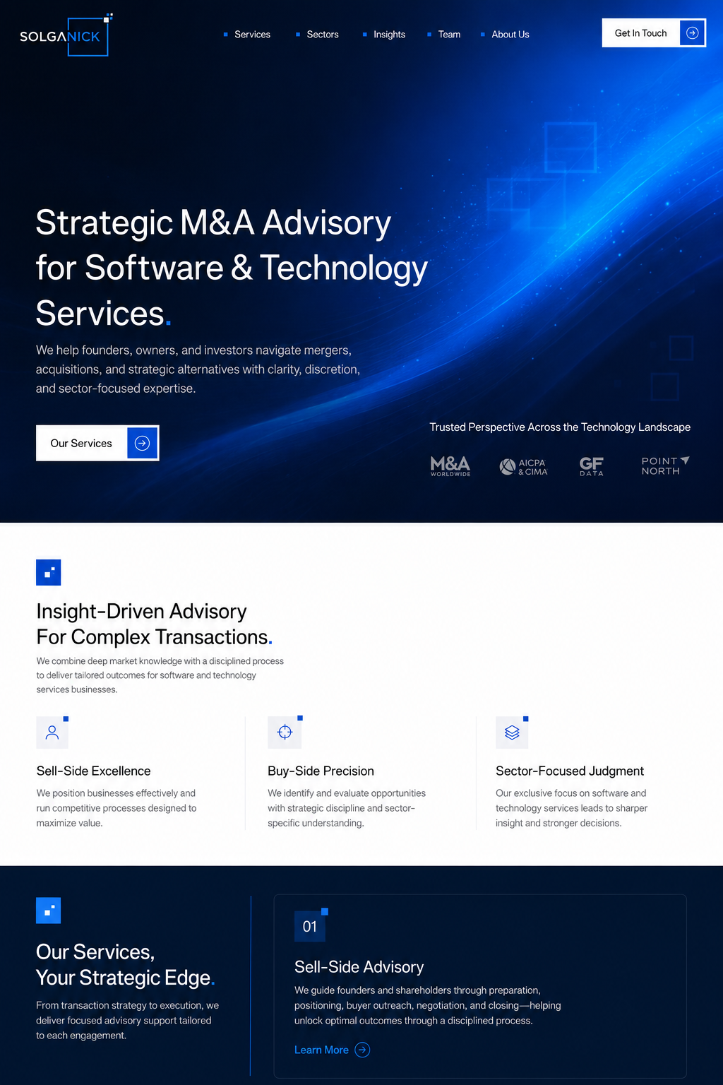
Create a high-fidelity desktop landing page design for a boutique investment bank specializing in software and technology services M&A.

The design should feel minimalist, premium, professional, and highly credible. Use a deep navy, white, and electric blue palette. The layout should be restrained and editorial, with strong typography, generous whitespace, subtle geometric accents, and a clear visual hierarchy.

The audience is founders, shareholders, investors, and strategic acquirers evaluating a high-stakes advisory partner. The page should communicate trust, discretion, authority, sector expertise, and calm confidence.

Include:
- top navigation with logo, Services, Sectors, Insights, Team, About, Contact
- CTA button: Start a Confidential Conversation
- hero headline: Strategic M&A Advisory for Software & Technology Services
- supporting copy about helping founders, owners, and investors navigate mergers, acquisitions, and strategic alternatives
- services section with Sell-Side Advisory, Buy-Side Advisory, Valuation & Positioning, Market Intelligence
- sector expertise section focused on software and technology services
- trust/differentiator section with senior-led execution, sector specialization, tailored advice, confidentiality
- final CTA section

Avoid:
- generic fintech illustrations
- cartoon graphics
- excessive gradients
- loud animations
- crypto-style visuals
- overdesigned SaaS aesthetics

The final result should look like a polished premium finance website mockup suitable for a real boutique investment banking brand.
This prompt works because it gives AI:
- category
- audience
- emotional target
- content structure
- visual style
- color direction
- things to avoid
AI needs constraints.
Without constraints, it gets creative in the worst possible way.
Step 9: Audit the AI Output Like a Designer
Once AI gives you a landing page concept, do not just accept it.
Audit it.
Ask:
- Does the page feel trustworthy?
- Is the headline specific?
- Does the CTA match the category?
- Does the design look banking-specific or generic?
- Are the colors appropriate?
- Is there enough restraint?
- Are the sections in the right order?
- Is the copy too vague?
- Does the page communicate risk reduction?
- Would the target audience take this seriously?
- Does the design match the company’s existing brand?
- Does anything feel like fake fintech decoration?
Use this AI audit prompt:
Audit this banking landing page concept.

Evaluate:
1. Trust and credibility
2. Clarity of positioning
3. Audience relevance
4. Financial services tone
5. Visual hierarchy
6. CTA strength
7. Generic or cliché language
8. Missing trust signals
9. Conversion flow
10. What should be improved before presenting it to a client

Be direct and specific.
The audit step is where you turn AI output into actual design thinking.
Otherwise, you are just accepting whatever the machine coughed up.
Step 10: Turn the Landing Page Into a Client Pitch
If you are creating the landing page for a freelance design gig, the design alone is not enough.
You need to explain the thinking.
For a banking landing page, your pitch should not say:
“I made a modern and professional design.”
That is weak.
Say something like:
“The competitor references were useful less as visual templates and more as trust signals. For this landing page, the goal was to create the same feeling of authority, discretion, and institutional credibility, while using the brand’s existing visual identity to keep the concept specific. The structure focuses on clear positioning, service clarity, sector expertise, and a confidential CTA appropriate for a high-stakes financial audience.”
That tells the client you understood the industry.
The design shows taste.
The explanation shows judgment.
You need both.
Banking Landing Page AI Prompt Pack
Here are the core prompts you can reuse.
Prompt 1: Brief Decoder
Analyze this banking landing page brief.

Separate:
- literal request
- hidden strategic meaning
- target audience
- emotional job
- trust signals needed
- visual risks
- recommended page structure
- strongest pitch angle

Brief:
[Paste brief]
Prompt 2: Competitor Reference Decoder
Analyze these competitor references for a banking/finance landing page.

Do not copy them visually. Instead, identify:
- what feeling they create
- what trust signals they use
- what layout patterns are useful
- what visual choices are category-standard
- what should be avoided
- how to create a differentiated direction

References:
[Paste competitor names or URLs]
Prompt 3: Banking Page Structure
Create a landing page structure for a [firm type] serving [audience].

The page should communicate:
- trust
- clarity
- authority
- category expertise
- low-risk next step

Include section titles, section purpose, suggested copy, and CTA recommendations.
Prompt 4: Finance Copywriter
Write landing page copy for a premium banking/financial services brand.

Tone:
- clear
- calm
- credible
- specific
- restrained
- not hype-driven

Avoid:
- generic finance clichés
- exaggerated claims
- vague corporate language

Firm:Audience:
[describe audience]Services:
[list services]Prompt 5: Visual Direction
Create a visual identity direction for a banking landing page.

Include:
- palette
- typography
- image style
- layout style
- icon style
- motion style
- trust-building elements
- what to avoid

The design should feel:Prompt 6: AI Website Mockup Prompt
Create a high-fidelity landing page mockup for a [banking/finance firm type].

Use this brand direction:Audience:
[insert audience]Emotional target:
[insert trust/authority/confidence goal]Sections:
[insert page sections]Style:
[insert visual style]Avoid:
[insert things to avoid]What Most People Get Wrong When Creating Banking Landing Pages With AI
They Make It Too Generic
A banking landing page cannot just say “financial solutions.”
That means nothing.
Be specific.
For who?
For what problem?
In what market?
With what outcome?
They Overuse Blue
Blue is common in banking because it signals trust and stability.
But blue alone does not create trust.
Structure creates trust.
Copy creates trust.
Proof creates trust.
Restraint creates trust.
Blue just sits there wearing a tie.
They Ignore the Audience’s Fear
Finance visitors carry risk in their heads.
They are thinking about money, security, reputation, compliance, timing, privacy, and consequences.
The page should reduce those fears.
They Copy Competitors Too Literally
Competitors are useful as perception references.
Not design instructions.
Understand the feeling, then build it in the client’s own brand language.
They Use Vague Copy
Finance copy dies when it gets too abstract.
Use clear, direct language.
If the company does M&A advisory for software companies, say that.
Do not bury it under “strategic growth solutions for tomorrow’s leaders.”
That sentence should be taken outside and given a stern talking-to.
They Forget the CTA Context
A CTA for a banking page should match the level of decision.
“Start a Confidential Conversation” works for M&A.
“Open an Account” works for retail banking.
“Schedule a Private Consultation” works for wealth management.
“Get the App” works for fintech.
The CTA is not just a button.
It is a psychological bridge.
Final Thought: AI Helps You Build Faster, But Strategy Still Leads
AI can help you create a banking landing page much faster.
It can analyze the brief.
It can decode competitor references.
It can suggest structure.
It can write first-draft copy.
It can generate visual directions.
It can create prompt-ready website concepts.
But AI should not decide what the page means.
That is your job.
A strong banking landing page is not just a clean layout with financial words pasted on top.
It is a trust-building system.
Every part of the page should work together:
The headline clarifies.
The design reassures.
The structure guides.
The copy reduces uncertainty.
The CTA makes the next step feel appropriate.
That is how you create a banking landing page with AI that does not feel generic.
Use AI to move faster.
Use strategy to make the work matter.
Because in finance, looking modern is not enough.
The page has to feel trustworthy.
And that is the part you cannot fake with a gradient.