Most client briefs are not briefs.
They are small piles of clues wearing business clothes.
You get a few lines, a budget, a timeline, and three adjectives that have been used so many times they should legally be retired:
Clean.
Modern.
Professional.
Sometimes the client adds “innovative” if they are feeling dangerous.
And from that, you are supposed to understand the business, the audience, the design direction, the emotional tone, the conversion goal, the brand personality, the competitive landscape, and what kind of visual language will make them say, “Yes, that’s it.”
Lovely.
This is where AI becomes useful.
Not because AI magically knows the perfect answer. It does not. Sometimes it confidently invents nonsense with the energy of a consultant who found one McKinsey PDF in 2014.
But AI is very good at something else:
It helps you organize ambiguity.
It helps you take a vague client brief and break it into signals. It can help you identify what the client explicitly asked for, what they probably need, what is missing, and how to turn those fragments into a usable first direction.
That is the point of this article.
This is not about using AI to replace taste, strategy, or creative judgment.
It is about using AI as a brief decoder.
A machine for turning client scraps into something sellable.
Because when the client gives you almost nothing, your job is not to complain about the brief.
Your job is to create the first version of clarity.
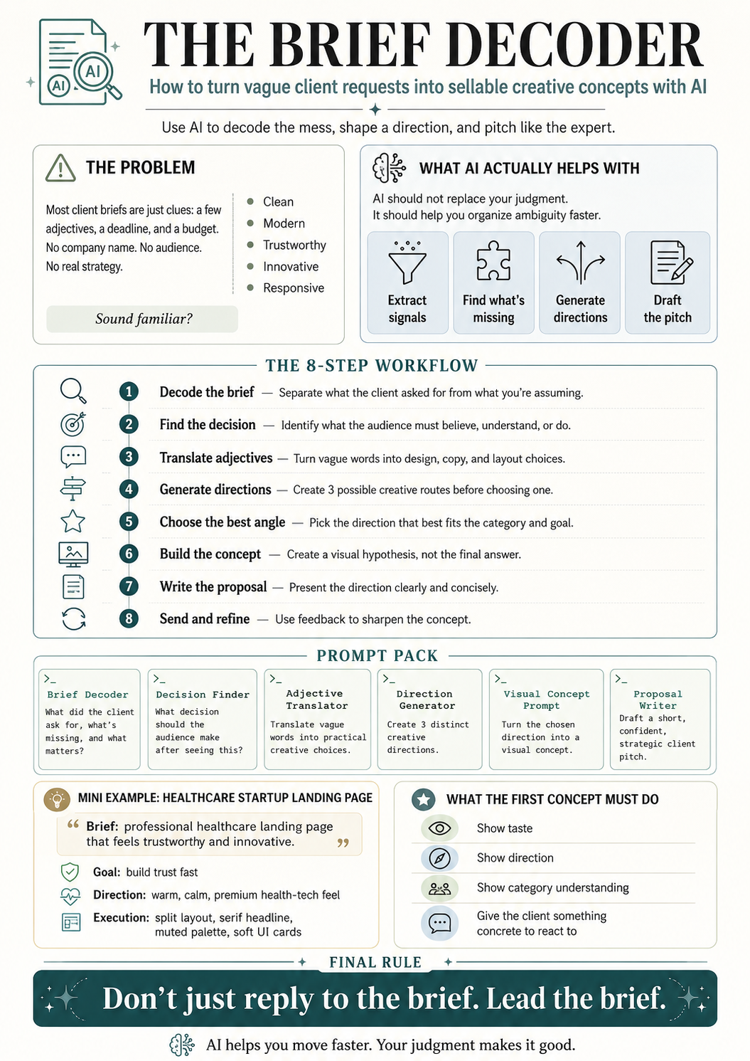
The Problem With Vague Client Briefs
Here is a typical client brief:
“We need a professional landing page for a healthcare startup website. The page should convey trust and innovation, using a clean layout, muted color palette, and clear typography. Key sections include a concise headline, value proposition, brief about the startup, call-to-action, and contact information. Imagery should reflect healthcare themes and the design must be responsive across devices.”
At first glance, that sounds decent.
It tells us the industry.
It tells us the format.
It tells us the mood.
It tells us the required sections.
It tells us the page should be responsive.
But it leaves out the juicy stuff.
What is the company called?
Who is the landing page for?
Patients? Doctors? Clinics? Investors? Employers?
What does the product actually do?
What is the main conversion goal?
What makes the startup different?
Is there an existing brand?
Are there competitors?
Is this a product landing page, sales page, waitlist page, or credibility page?
All missing.
And this is normal.
Clients often know the outcome they want, but not the language needed to describe the path.
They know they want the page to feel trustworthy.
They do not know whether that means serif typography, clean spacing, proof blocks, restrained colors, clinical photography, soft UI cards, or more human-centered copy.
They know they want innovation.
They do not know whether innovation should look like a product dashboard, a futuristic illustration, a clean SaaS interface, or a warm healthcare ecosystem.
That is where you come in.
And that is where AI can help you move faster.
The Big Idea: Use AI to Decode the Brief, Not Replace the Thinking
The wrong way to use AI is this:
“Write me a proposal for this client brief.”
That can work, but it usually gives you generic soup.
The better way is to use AI in stages.
First, make it analyze the brief.
Then make it extract the hidden signals.
Then make it translate vague words into creative decisions.
Then make it generate concept directions.
Then make it write the pitch.
Do not ask AI to jump straight to the final answer.
That is like handing someone a pile of bricks and asking them to build a hotel by Friday.
You need a workflow.
Here is the basic system:
- Decode the brief
- Identify what is missing
- Extract industry expectations
- Translate adjectives into design decisions
- Create directional concepts
- Build a visual reference
- Write the short proposal
- Position the concept as a starting point, not the final answer
This makes the process much stronger.
AI becomes the assistant, not the creative director.
You still make the calls.
You still decide what feels right.
You still bring taste, judgment, and positioning.
AI just gets the mess onto the table faster.
Step 1: Decode What the Client Actually Said
Before creating anything, separate what the client explicitly asked for from what you are assuming.
This matters because vague briefs create dangerous hallucinations.
Not AI hallucinations.
Human hallucinations.
You see “healthcare startup” and suddenly your brain invents a telehealth company, a patient app, a clinic dashboard, and a founder named Marcus who definitely wears Allbirds.
Slow down.
Start with what is actually in the brief.
For the healthcare landing page example, the explicit requirements are:
- Professional landing page
- Healthcare startup website
- Trust and innovation
- Clean layout
- Muted color palette
- Clear typography
- Concise headline
- Value proposition
- Brief about the startup
- Call-to-action
- Contact information
- Healthcare-themed imagery
- Responsive design
That is the foundation.
Everything else is interpretation.
And interpretation is fine, as long as you know it is interpretation.
Prompt 1: Decode the Brief
Use this:
Prompt:
Analyze this client brief and break it into five parts:
- What the client explicitly asked for
- What the client likely needs but did not say
- What information is missing
- What risks a junior designer or freelancer might misunderstand
- What a strong first creative direction could focus on
Here is the brief:
[Paste brief]
Example Output Direction
For the healthcare brief, the AI should help you see something like this:
The client explicitly wants a healthcare landing page with trust, innovation, clean layout, muted colors, clear typography, and responsive design.
They likely need a page that quickly establishes credibility, explains the startup’s value, and encourages users to take action.
Missing information includes the company name, product type, audience, brand identity, competitors, conversion goal, and tone of voice.
A junior designer might make the page too generic, too clinical, too blue-and-white, or too close to the reference.
A strong first direction should balance healthcare trust with startup warmth and innovation.
That is already useful.
Now you are not staring at a vague brief.
You have a map.
Step 2: Identify the Real Decision Behind the Project
Every client project exists because someone needs another person to make a decision.
A landing page is not just a page.
It is a decision surface.
The visitor lands there and needs to decide something:
Do I trust this company?
Do I understand what they do?
Do I believe this is credible?
Do I want to book a demo?
Do I want to contact them?
Do I want to learn more?
Do I want to sign up?
For the healthcare startup landing page, the likely decision is:
“Can I trust this healthcare company enough to take the next step?”
That next step might be booking a demo, joining a waitlist, contacting the startup, or exploring the service.
But the emotional sequence is probably:
Trust first.
Clarity second.
Action third.
That matters.
Because it tells you the page should not start with visual chaos, vague slogans, or overly clever copy.
Healthcare is not the place to get too cute.
Nobody wants their medical platform introduced like a perfume ad.
Prompt 2: Find the Decision
Prompt:
Based on this brief, what decision is the final audience supposed to make after seeing the work? Give me the likely decision, the emotional barriers to that decision, and what the design/copy needs to do to reduce those barriers.
Brief:
[Paste brief]
Example Output Direction
For the healthcare landing page, the decision might be:
The user needs to trust the startup enough to engage.
The barriers might include skepticism, lack of familiarity, uncertainty about the service, fear of poor quality, and confusion about what the startup actually offers.
The design needs to reduce those barriers through clear messaging, calm hierarchy, credible visuals, human warmth, and a simple CTA.
That gives you the strategic spine.
Now you know what the design is supposed to do.
Not just what it is supposed to look like.
Big difference.
Step 3: Translate Vague Adjectives Into Creative Decisions
Client adjectives are not useless.
They are just undercooked.
When a client says “clean,” “modern,” or “trustworthy,” they are giving you emotional signals. Your job is to translate those signals into practical creative choices.
For example:
“Trustworthy” can become:
- Calm spacing
- Clear hierarchy
- Readable typography
- Human imagery
- Professional tone
- Soft contrast
- Credibility blocks
- No aggressive visual gimmicks
“Innovative” can become:
- Modern UI cards
- Subtle product visuals
- Forward-looking copy
- Light tech cues
- Fresh layout rhythm
- Contemporary interaction patterns
“Muted palette” can become:
- Warm neutrals
- Soft greens
- Dusty blues
- Gentle beige tones
- Low-saturation accents
- Avoiding loud medical blues unless brand-relevant
“Clear typography” can become:
- Strong headline hierarchy
- Serif or humanist type for warmth
- Highly legible body copy
- Limited font pairing
- Large enough mobile text
- Strong line spacing
This is where you start sounding like someone who knows what they are doing.
Anyone can repeat the client’s words.
Experts translate them.
Prompt 3: Translate Adjectives Into Design Choices
Prompt:
Take the adjectives and direction from this brief and translate them into practical creative decisions.
For each adjective or phrase, suggest:
- Color palette implications
- Typography implications
- Layout implications
- Imagery implications
- UI/component implications
- Copy tone implications
Brief:
[Paste brief]
Example Output Direction
For the healthcare example:
Trustworthy: use calm hierarchy, legible typography, professional language, proof-oriented sections, and human-centered imagery.
Innovative: use refined interface elements, modern cards, subtle gradients or layered panels, and language that suggests progress without sounding like science fiction.
Clean layout: use generous whitespace, short copy blocks, clear section rhythm, and a single dominant CTA.
Muted palette: use warm off-whites, sage, stone, soft blue-gray, or muted teal.
Clear typography: use a serif headline for warmth and distinction, paired with a simple sans-serif body font for readability.
Now the brief is no longer vague.
It has creative implications.
That is what AI helps you extract quickly.
Step 4: Create Three Directional Concepts
Do not create one idea too early.
Use AI to generate multiple directions first.
This gives you options.
For example, the healthcare landing page could go in several directions:
Direction 1: Calm Clinical Trust
This version feels medical, clean, and professional.
It would use soft whites, muted blue-gray, restrained typography, doctor/patient imagery, and a clear CTA.
Good for: hospitals, clinical tools, patient platforms, provider-facing healthcare services.
Risk: could feel generic if not handled carefully.
Direction 2: Warm Human Healthcare
This version feels softer, more personal, and more patient-friendly.
It would use warm neutrals, sage greens, serif headlines, human photography or illustration, and gentle UI cards.
Good for: wellness platforms, patient care startups, mental health services, telehealth, family care.
Risk: could feel too lifestyle-focused if the product is more technical.
Direction 3: Modern HealthTech Platform
This version feels more startup-like and product-led.
It would use clean interface visuals, dashboard elements, subtle gradients, modular sections, and sharper copy.
Good for: SaaS healthcare platforms, AI health tools, B2B healthcare, clinic management software.
Risk: could feel too cold or too tech-heavy if the audience is patients.
This is useful because you can choose the best direction based on the brief.
For the example, I would probably choose something between Direction 2 and Direction 3:
Warm, trustworthy healthcare with enough product polish to feel innovative.
Prompt 4: Generate Creative Directions
Prompt:
Based on this client brief, create three distinct creative directions.
For each direction, include:
- Name of the concept
- Visual style
- Emotional tone
- Color palette direction
- Typography direction
- Layout approach
- Imagery style
- Why this fits the brief
- What type of healthcare startup this would work best for
- Main risk of this direction
Brief:
[Paste brief]
This prompt gives you a menu of strategic options.
You do not need to use all of them.
You use them to think.
That is the point.
AI is not the chef. It is the prep cook chopping onions in the background.
Useful, but please do not let it season the whole meal.
Step 5: Build the Visual Concept
Once you have the direction, you can create a visual concept.
This could be done in Figma, Midjourney, ChatGPT image generation, Figma Make, Framer, Webflow, or whatever tool you use.
The important thing is to position it correctly.
This is not the final website.
It is a visual hypothesis.
A direction.
A way to show the client:
“Based on your brief, here is how I would begin shaping the project.”
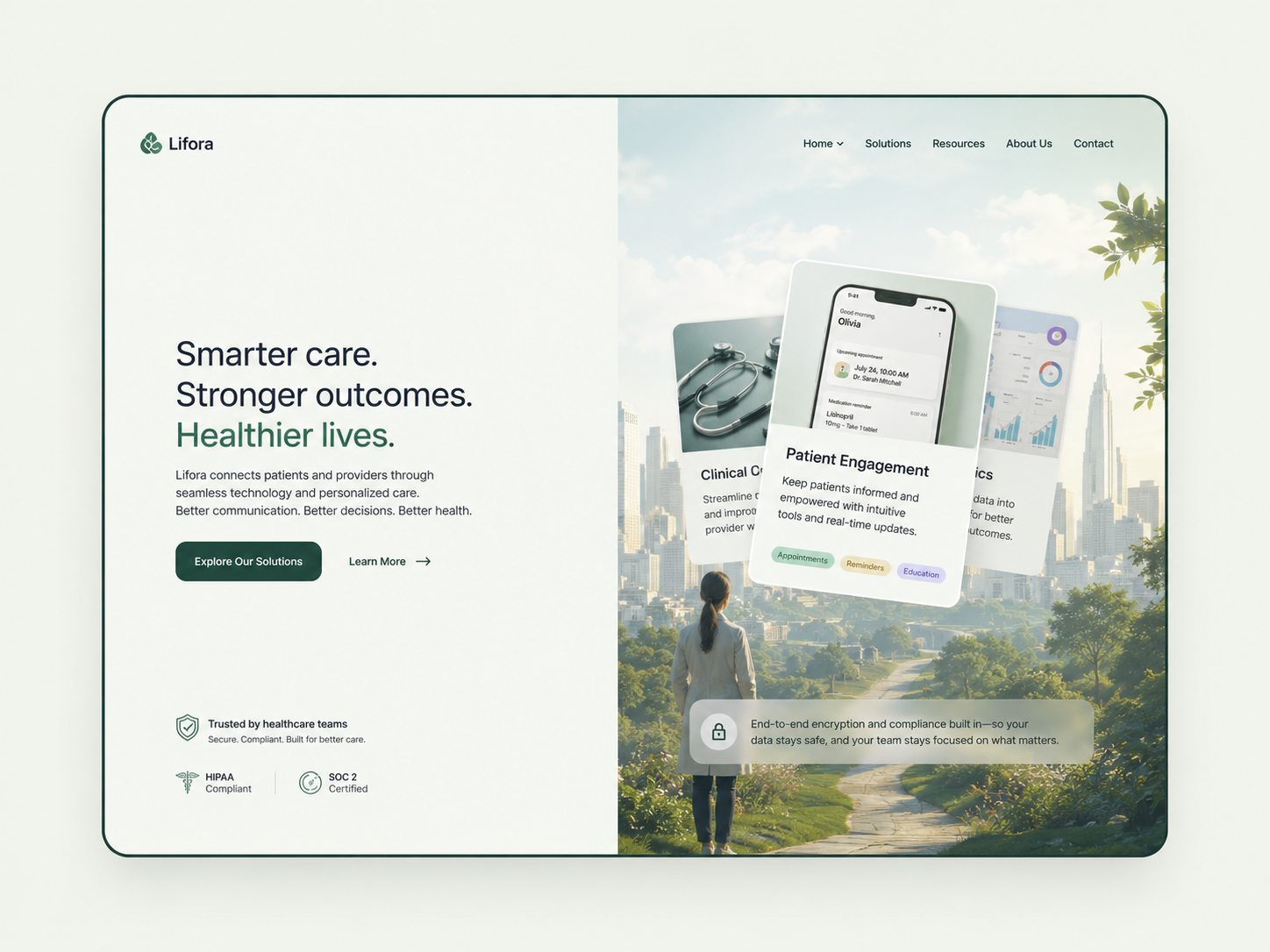
For the healthcare landing page, the visual concept could include:
- Split hero layout
- Serif headline
- Calm muted palette
- Healthcare-inspired imagery
- Clear CTA
- Soft interface blocks
- Short value proposition
- Trust-led copy
- Desktop-first composition with mobile adaptability
The reference can guide the structure, but you change the identity.
This is important.
Do not copy the reference.
Extract the useful logic.
Keep:
- Layout rhythm
- Section clarity
- Hero structure
- CTA placement
- Visual balance
Change:
- Palette
- Typography
- Copy
- Imagery
- Icons
- UI details
- Brand feeling
That is how you respect the reference without becoming a photocopier with a Behance account.
Prompt 5: Create a Visual Concept Prompt
Use this if you are generating a design concept with AI:
Prompt:
Create a high-fidelity landing page hero concept for a healthcare startup.
The design should feel trustworthy, calm, premium, and innovative. Use a clean split-layout composition with messaging on the left and a healthcare-inspired visual system on the right. Use a muted warm palette, elegant serif headline typography, readable sans-serif body copy, soft UI cards, clear CTA buttons, and generous whitespace.
The page should include a logo placeholder, navigation, concise headline, short value proposition, primary CTA, secondary CTA, trust indicators, and a refined healthcare visual area. Avoid generic hospital-blue design, stock medical clichés, cluttered SaaS dashboards, and overly futuristic visuals. The result should feel like a polished directional concept that can be adapted to a real healthcare startup brand.
This gives you something to work with.
Again, not final.
Directional.
That distinction makes you look professional.
Step 6: Write the Proposal Around the Direction
Now that you have decoded the brief and created a concept, write the client pitch.
Keep it short.
A client does not need a 900-word essay about your creative soul.
They need to understand:
- You understood the brief
- You have a point of view
- You can adapt the reference
- You know what the deliverables are
- You can lead the project
For the healthcare landing page example, the proposal could sound like this:
Example Pitch
Hi [Client Name],
I’d love to help design the landing page for your healthcare startup.
Based on the brief, I’d approach this as a trust-led healthcare landing page with a clean, modern structure and a refined visual system. The goal would be to make the startup feel credible quickly, while still giving it enough warmth and innovation to avoid the usual generic healthcare look.
For the visual direction, I’d use the reference as a structural concept rather than copying its identity. That means keeping the strong layout logic, clear hero section, CTA placement, and polished landing page rhythm, but rebuilding the palette, typography, copy, imagery, and UI details around your brand.
One direction I’d explore is a calm split-layout design with serif-led headlines, muted healthcare-inspired colors, clear value proposition messaging, and soft interface elements that make the page feel premium, human, and easy to trust.
The landing page would include the core sections from your brief: headline, value proposition, short startup overview, CTA, contact information, and responsive desktop/mobile versions.
The final result would be a polished landing page concept that feels ownable to your startup, easy for users to understand, and ready for development handoff.
Best,
[Your Name]
That is enough.
It does not beg.
It does not overexplain.
It does not say “I am passionate” seventeen times like a freelancer trapped in 2012.
It shows thinking.
That is the sale.
Prompt 6: Write the Client Proposal
Prompt:
Write a short client proposal based on this brief and creative direction.
The proposal should:
- Sound confident but not arrogant
- Present the design as a visual direction, not a final answer
- Explain how the reference will be adapted, not copied
- Mention the core deliverables
- Keep the wording concise
- Make me sound like someone who can lead the project
Brief:
[Paste brief]
Creative direction:
[Paste chosen direction]
Why the First Concept Does Not Need to Be Perfect
This is the part that matters.
The first concept does not need to be the final design.
The point is not to guess perfectly.
The point is to show your thinking.
A strong concept shows:
- Taste
- Direction
- Confidence
- Category understanding
- Ability to interpret vague inputs
- Ability to make decisions
- Ability to move the project forward
Even if the client says, “This is not exactly the direction,” you have still created a better conversation.
Before the concept, the client can only say:
“We want it clean and modern.”
After the concept, the client can say:
“We like the structure, but the colors should be more clinical.”
“We like the serif typography, but our brand is more technical.”
“We like the calm feeling, but we need it to feel more B2B.”
“We like the layout, but the audience is doctors, not patients.”
That is progress.
A concept gives the client something to react to.
And reaction creates clarity.
This is why visual direction is powerful in vague projects.
You are not trying to be right immediately.
You are trying to make the next conversation smarter.
The Brief Decoder Workflow
Here is the full workflow in one place.
1. Paste the client brief into AI
Ask AI to separate explicit requirements, likely needs, missing context, risks, and possible directions.
2. Find the decision
Ask what the end audience is supposed to believe, understand, or do after seeing the work.
3. Translate adjectives into creative decisions
Turn vague words like “trustworthy,” “modern,” and “premium” into design, copy, and layout choices.
4. Generate multiple directions
Ask for three possible creative directions so you can compare options.
5. Choose the strongest angle
Pick the direction that best fits the industry, project type, audience assumptions, and emotional tone.
6. Create a visual concept
Use Figma, AI image generation, Figma Make, Framer, Webflow, or your tool of choice to make the idea tangible.
7. Write the proposal
Frame the concept as a starting direction that can be refined once the brand, audience, and product details are clarified.
8. Send the pitch
Keep it short, specific, and confident.
That is it.
No need to turn every proposal into a doctoral thesis.
The goal is to show you can think.
The Copy-Paste Prompt Pack
Here is the whole thing as a reusable prompt system.
Prompt 1: Brief Decoder
Analyze this client brief and break it into five parts:
- What the client explicitly asked for
- What the client likely needs but did not say
- What information is missing
- What risks a junior designer or freelancer might misunderstand
- What a strong first creative direction could focus on
Client brief:
[Paste brief]
Prompt 2: Decision Finder
Based on this brief, what decision is the final audience supposed to make after seeing the work?
Give me:
- The likely decision
- The emotional barriers to that decision
- The practical information barriers
- What the design needs to do
- What the copy needs to do
Client brief:
[Paste brief]
Prompt 3: Adjective Translator
Take the adjectives and creative direction from this brief and translate them into practical decisions.
For each adjective or phrase, suggest:
- Color palette implications
- Typography implications
- Layout implications
- Imagery implications
- UI/component implications
- Copy tone implications
Client brief:
[Paste brief]
Prompt 4: Creative Direction Generator
Based on this client brief, create three distinct creative directions.
For each direction, include:
- Name of the concept
- Visual style
- Emotional tone
- Color palette direction
- Typography direction
- Layout approach
- Imagery style
- Why this fits the brief
- What type of company this would work best for
- Main risk of this direction
Client brief:
[Paste brief]
Prompt 5: Visual Concept Generator
Create a high-fidelity landing page concept based on this direction.
The design should include:
- Overall visual style
- Layout structure
- Hero section composition
- Typography direction
- Color palette
- Imagery style
- CTA structure
- UI details
- Mobile responsiveness considerations
- What to avoid
Client brief:
[Paste brief]
Chosen creative direction:
[Paste direction]
Prompt 6: Client Proposal Writer
Write a short client proposal based on this brief and creative direction.
The proposal should:
- Sound confident but not arrogant
- Present the concept as a visual direction, not a final answer
- Explain how the reference will be adapted, not copied
- Mention the core deliverables
- Keep the wording concise
- Make me sound like someone who can lead the project
Client brief:
[Paste brief]
Creative direction:
[Paste chosen direction]
Example: The Healthcare Landing Page Brief
Let’s apply the workflow quickly.
The client wants a healthcare startup landing page.
The explicit ask is:
- Professional landing page
- Trust and innovation
- Clean layout
- Muted color palette
- Clear typography
- Healthcare imagery
- Responsive design
- Headline, value proposition, about section, CTA, contact information
The likely need is:
A credible landing page that helps visitors understand the startup quickly and trust it enough to take action.
The missing information is:
- Company name
- Audience
- Product
- Brand identity
- Conversion goal
- Competitors
- Tone of voice
- Existing assets
The creative direction could be:
A warm, trust-led healthcare landing page with a split hero layout, serif-led typography, muted colors, soft UI elements, and clear CTA hierarchy.
The proposal angle becomes:
“I will use the reference as a structural direction, but rebuild the design identity around your brand.”
That is much stronger than:
“Hello, I can design this.”
Of course you can design it.
So can 400 other people with a Figma account and a dream.
The question is whether you can make the client believe you understand what the design needs to accomplish.
That is the difference.
How Small Teams Can Use This
This workflow is especially useful for:
- Freelance designers
- Web designers
- Brand identity designers
- Small agencies
- Creative directors
- Consultants
- Content strategists
- Founders pitching services
- No-code builders
- AI-assisted operators
Basically, anyone who needs to respond to vague opportunities quickly without sounding generic.
You can use it for:
- Dribbble gigs
- Upwork proposals
- Website inquiries
- Branding projects
- Pitch deck requests
- Landing page projects
- Consulting leads
- Cold outreach replies
- RFPs
- Internal concept development
The real benefit is speed plus clarity.
Instead of staring at the brief for 40 minutes and calling it “strategic thinking,” you can run the brief through the decoder and start shaping a direction within minutes.
Then your human judgment kicks in.
That is the combination.
AI helps you accelerate the messy first pass.
You make it good.
What AI Cannot Do Here
AI can help you decode the brief.
It can help you generate options.
It can help you structure the proposal.
It can help you translate vague language into creative choices.
But it cannot fully replace:
- Taste
- Context
- Client judgment
- Visual sensitivity
- Business instinct
- Category experience
- Knowing when something feels wrong
- Knowing when less is better
- Knowing when the client actually needs a different solution
AI can produce ten directions.
But you still need to know which one is worth sending.
That is where human skill matters.
Especially in design.
Because design is not just output.
It is selection.
The taste is in the choosing.
The Final Rule: Do Not Just Reply to the Brief
Do not just reply to the brief.
Lead the brief.
That does not mean pretending you know everything.
It means taking the limited information the client gave you and moving it one step closer to a decision.
If they give you adjectives, translate them.
If they give you a reference, interpret it.
If they give you an industry, extract category expectations.
If they give you sections, structure the page.
If they give you nothing but a deadline and budget, light a candle and use the prompts.
A vague brief is not the enemy.
A vague response is.
The client does not need you to guess perfectly.
They need to feel that you can guide the project.
That is what this workflow is for.
AI does not replace the expert.
It helps the expert move faster.
And when the client gives you three adjectives and a half-written brief, faster clarity is not a luxury.
It is the whole game.