A technical client brief is rarely just a technical client brief.
On paper, it usually looks innocent enough.
Logo.
Color palette.
Font pairing.
Website direction.
Maybe a moodboard.
Maybe “make it clean, modern, and professional,” because apparently we all signed a global agreement to use those three words until the sun explodes.
But underneath that tidy little list of deliverables, there is usually a much harder problem hiding.
The client is trying to explain something complex.
They may be building an automation system, a SaaS product, an AI platform, a robotics tool, a biotech solution, an infrastructure product, or some very specific technical service that makes perfect sense to them and almost nobody else within the first 30 seconds.
That is where the real work begins.
Because the challenge is not simply to make the brand “look good.”
The challenge is to translate the technical thing into a visual and verbal direction that the market can understand.
And this is where AI can become genuinely useful.
Not as a magic logo vending machine.
Not as a “give me 20 futuristic brand ideas” slot machine.
But as a thinking partner that helps you read the brief, identify the signals inside it, avoid obvious clichés, and turn unclear client language into a usable creative direction.
The Real Problem With Technical Briefs
Technical founders and consultants often struggle to explain what they do because they are too close to the work.
That is not an insult. It is normal.
When you spend months or years inside a system, product, workflow, model, or technical category, you start speaking from the inside out. You explain the mechanism. You describe the stack. You talk about how it works. You mention the tools, the architecture, the process, the workflow logic, the proprietary method, and the clever technical decision nobody outside your team knows how to appreciate yet.
But buyers usually do not start there.
They start with a much simpler set of questions:
What problem does this solve?
Why should I care?
Why now?
Why is this better than the current way?
Why should I trust you?
What changes if this works?
And if those questions are not answered clearly, the buyer does not magically become more interested because the technology is complicated.
They just get tired.
This is why deep tech branding, technical consulting branding, and SaaS positioning are difficult. The company has to preserve the depth of the work while making the value easier to understand.
That is not dumbing it down.
That is translation.
A Real Example: The Automation Consultant Brief
I recently worked through a brand direction for a technical consultant I found through Dribbble.
The brief was for a freelance tech consultant website. He was based in London and helped growing businesses replace spreadsheet chaos with better systems, automation, Airtable-style workflows, and operational structure.
His requested deliverables were straightforward:
A logo.
A simple mark or icon.
A refined color palette.
A font pairing.
A short one-page style sheet.
Simple enough.
But the more interesting part was the language he used.
He said he wanted the brand to feel clean, confident, understated, calm, and competent. He did not want it to feel corporate or overly “techy.” His tagline was:
Build less. Run better.
That is where most people would jump straight into logo references.
I did not.
The first step was to decode the brief.
What “Decoding the Brief” Actually Means
When I say I identified keywords in the brief, I do not mean SEO keywords.
I was not doing keyword research.
I was not opening Ahrefs in the middle of a brand pitch like some deranged content goblin trying to rank a logo for “best oxblood automation consultant near me.”
What I mean is that I looked for strategic signals in the client’s language.
The words that reveal the emotional, technical, and positioning problem behind the project.
For example:
“Spreadsheet chaos” tells us the customer’s current world is messy, manual, fragmented, and probably held together by one terrifying Google Sheet named “FINAL_final_v7_actual_USE_THIS.”
“Automation and systems consultant” tells us the client creates structure, flow, and repeatability.
“Growing businesses” tells us the audience is likely operationally stretched. These are people who are not looking for trendy technology. They are looking for less mess.
“Clean, confident, understated” tells us the brand should not shout.
“Calm and competent” tells us the emotional job of the brand is to create trust and control.
“Not corporate” tells us to avoid heavy enterprise visuals.
“Not techy” tells us something important, but also slightly dangerous, because “not techy” can mean many different things.
“Build less. Run better.” tells us the philosophy: this is not about adding more tools. It is about creating less operational noise and better business performance.
Those phrases are not decoration.
They are instructions.
The client may not know how to translate them into visual choices yet, but that is the designer’s job.
Or, in this case, the AI-assisted strategist’s job. Watch the full video breakdown here:
Turning Client Language Into Design Implications
Once you have the strategic signals, you can start turning them into design implications.
This is where AI can help you think faster, but only if you give it the right job.
Do not ask:
“Create a modern logo for an automation consultant.”
That will usually give you the usual nonsense: blue icons, gears, clouds, abstract arrows, maybe a little circuit shape if the AI is feeling spicy.
Instead, ask AI to interpret the meaning of the client’s language.
For example:
Spreadsheet chaos becomes visual order.
That could mean grids, modular layouts, structured spacing, clear hierarchy, and visual systems that feel organized.
Automation and workflows become connection.
That could mean schema diagrams, simple connector lines, system maps, process blocks, and repeated modules.
Calm and competent becomes restraint.
That could mean less color, more whitespace, fewer decorative elements, and a palette that feels controlled.
Not corporate becomes independent authority.
That could mean avoiding heavy navy enterprise design, fake boardroom polish, and cold consulting visuals.
Not techy becomes a question.
This is the most important one.
Because “not techy” does not automatically mean “warm lifestyle brand.”
It might mean the client does not want corporate-tech clichés.
That distinction matters.
The First Moodboard Is a Hypothesis
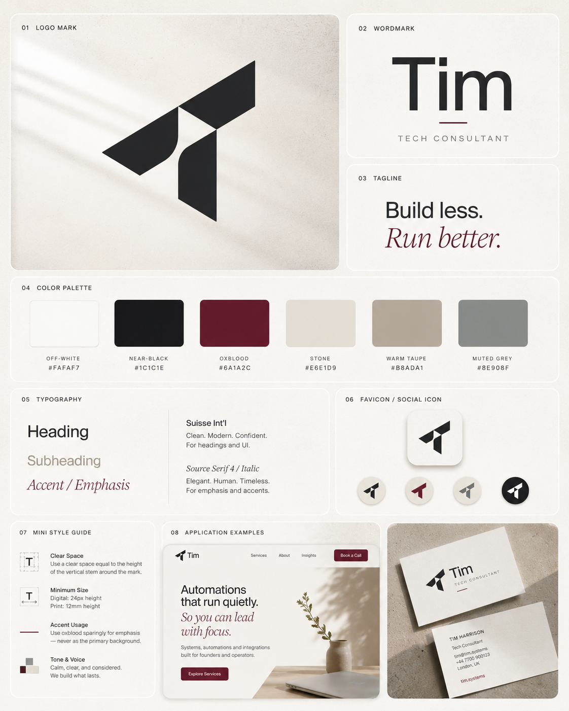
Based on the first brief, I created a moodboard direction that leaned calm, refined, and consultant-led.
The client already had a strong color direction:
Off-white.
Near-black.
Oxblood.
That was useful because it immediately moved the brand away from the usual startup blue, teal, and purple gradient zone where SaaS brands go to become indistinguishable from each other.
The first direction used a refined geometric “T” mark based on his name, a clean wordmark, warm neutrals, understated typography, and a premium bento-board layout showing how the identity could work across a website, favicon, business card, and simple brand style sheet.
This was not meant to be the final answer.
It was a visual hypothesis.
That is how moodboards should be used.
A moodboard is not the strategy. It is a way to test the strategy visually.
It gives the client something concrete to react to before everyone wastes time polishing the wrong direction.
And that is exactly what happened.
The Client Clarified the Real Problem
After seeing the first moodboard, the client responded with something very useful.
He said that the headline on my profile — “I Make Deep Tech Brands Easier to Understand and Buy From” — was pretty much the exact problem he had.
His work was technical at its core, but his customers rarely were.
His brand had to do the translation.
That sentence clarified the actual project.
He was not just asking for a logo.
He was asking for a brand system that could sit between his technical work and his non-technical buyers.
That is the real job of branding for technical companies.
The brand has to help the buyer understand what is happening before the full explanation begins.
It has to create enough clarity and trust for the buyer to lean in rather than check out.
What “Not Techy” Really Meant
The client also clarified what he meant by “not techy.”
He did not mean soft lifestyle branding.
He did not mean warm editorial design.
He did not mean making the brand feel less technical.
He meant avoiding the usual corporate-tech clichés:
Blue gradients.
Abstract AI blobs.
Neural-network illustrations.
Floating dashboards.
Cloud icons.
Generic startup marks.
Vague “innovation” visuals.
The stuff you see everywhere.
The kind of brand direction that says “technology” but does not say anything specific about the actual company.
This changed the direction.
The goal was not to make the brand less technical.
The goal was to make it more specifically technical.
That is a massive difference.
Generic Tech vs. Quietly Technical
A lot of technical brands fall into the same visual trap.
They want to show that they are modern and technical, so they reach for the most obvious symbols of technology.
Blue gradients.
Glowing networks.
AI heads.
3D SaaS letters.
Cloud shapes.
Abstract dashboards.
Little floating UI cards.
A few connected nodes sprinkled around like parsley.
The problem is that this does not communicate technical expertise. It communicates the category in the broadest possible way.
It says:
“We are technology.”
But it does not say:
“We understand this specific problem.”
For an automation and systems consultant, the better visual language comes from systems, not generic tech.
That means:
Schema diagrams.
Modular grids.
Connector lines.
Monospace labels.
System maps.
Documentation-style clarity.
Small technical notes.
Structured layouts.
Cooler neutrals.
Restrained accent colors.
This kind of direction still feels technical, but it feels precise.
It communicates order, logic, and clarity without falling into the usual SaaS soup.
And yes, SaaS soup is a real thing. It is what happens when a dashboard, a gradient blob, and the phrase “unlock your workflow potential” are left unsupervised.
How AI Helps in This Process
AI helps when you use it to expand and test interpretation.
It can help you:
Summarize the client’s brief.
Extract strategic signals.
Separate functional requirements from emotional requirements.
Identify visual clichés to avoid.
Generate moodboard territories.
Translate vague words into visual choices.
Create prompt directions for moodboard generation.
Compare two different visual routes.
Write a clearer explanation back to the client.
The important part is that AI should not replace your thinking.
It should accelerate your thinking.
You still need to decide what matters.
You still need to understand the client.
You still need to know when the first output is wrong, half-right, or useful only because it provokes a better clarification.
That is what happened in this project. The first moodboard helped surface a more precise definition of “not techy.” Then the second direction became much sharper.
A Simple AI Workflow for Translating Technical Briefs
Here is the workflow I would use again.
1. Paste the Client Brief Into AI
Start with the full brief. Do not summarize it too early. The exact wording matters because clients often reveal the real direction in the phrases they choose.
Prompt:
“Read this client brief and identify the strategic signals inside it. Separate the functional requirements, emotional cues, audience clues, visual preferences, category clichés to avoid, and unanswered questions. Do not create design ideas yet. First, decode what the client is really asking for.”
This keeps AI from jumping straight into logo soup.
2. Extract the Strategic Signals
You want AI to identify the important phrases and explain why they matter.
Prompt:
“From this brief, list the key phrases that should influence the brand direction. For each phrase, explain what it suggests emotionally, visually, and strategically.”
For the Tim brief, this would include phrases like “spreadsheet chaos,” “calm and competent,” “understated,” “not techy,” and “Build less. Run better.”
3. Turn the Signals Into Visual Principles
Now translate the language into design implications.
Prompt:
“Turn these strategic signals into visual principles. For each principle, suggest how it could affect logo style, typography, color, layout, imagery, and moodboard references.”
This is where the brief becomes useful.
You move from vague language to design decisions.
4. Identify the Clichés to Avoid
This is especially important for technical brands.
Prompt:
“Based on this category and client language, identify the most likely visual clichés we should avoid. Explain why each cliché would weaken the brand.”
For automation, SaaS, AI, or systems consulting, this might include blue gradients, cloud icons, abstract neural networks, floating dashboards, generic startup marks, and corporate stock illustrations.
5. Create Two Moodboard Territories
Do not create one direction too early.
Create contrast.
Prompt:
“Create two moodboard directions. Direction A should represent the generic cliché version of this category, so we can clearly avoid it. Direction B should represent the more strategic direction based on the client’s language. Describe the palette, typography, layout, logo feel, visual motifs, and brand personality for each.”
This is useful because clients often understand direction better through contrast.
They may not know what they want until they see what they definitely do not want.
6. Generate the Moodboard Prompt
Once the direction is clear, then create the visual prompt.
Prompt:
“Write a detailed AI image prompt for a brand moodboard based on Direction B. Include the logo direction, color palette, typography style, visual motifs, layout structure, brand applications, and what to avoid. The moodboard should look like a professional presentation board, not a random collage.”
This creates a much better starting point than “make a brand board for a tech consultant.”
7. Use the First Moodboard as a Conversation Tool
Send the moodboard with a clear explanation.
Do not pretend it is final.
Frame it as a direction.
Something like:
“This explores a calmer, more structured route based on the language in your brief. I focused on order, restraint, and trust rather than generic SaaS visuals. The goal is to make the brand feel technical enough to be credible, but clear enough for non-technical buyers.”
That kind of explanation helps the client respond strategically instead of saying, “Can we make it pop?”
A phrase that has caused more creative suffering than most wars.
Prompt Template: Technical Brief to Brand Direction
Here is a reusable prompt you can adapt:
“Act as a senior brand strategist and visual identity director. I am working on a brand direction for a technical company or consultant.
Here is the client brief:
[PASTE BRIEF]
Your task is to decode the brief before creating visuals.
First, identify:
- The functional requirements
- The audience
- The core business problem
- The buyer’s likely pain points
- The emotional tone the brand needs to create
- The key phrases in the client’s language
- The strategic meaning behind each phrase
- The visual clichés this category should avoid
- The strongest visual territory based on the brief
Then translate the brief into:
- Brand personality
- Logo direction
- Color palette direction
- Typography direction
- Layout and spacing principles
- Visual motifs
- Moodboard references
- A short explanation I can send to the client
Important: Do not make the brand generic. Avoid obvious tech clichés unless they are being used as an anti-reference. The goal is to translate technical complexity into buyer clarity.”
Why This Matters for Technical Founders
This process is not only useful for designers.
It is useful for technical founders too.
Because a technical founder often knows the product deeply but struggles to explain it simply.
They may know the mechanism, but not the market-facing story.
They may know the architecture, but not the first sentence that makes a buyer care.
They may know the technical difference, but not the visual language that communicates that difference.
That is why the brand brief often comes out vague.
The founder says:
“Make it clean.”
But what they mean is:
“Make us look credible without making us look like a boring enterprise company.”
They say:
“Make it simple.”
But what they mean is:
“Help buyers understand something that is actually quite complex.”
They say:
“Not too techy.”
But what they mean is:
“Do not make us look like every other SaaS company with a blue gradient and a fake network graphic.”
The job is to hear the sentence underneath the sentence.
AI can help with that if you use it properly.
The Final Lesson
The best use of AI in branding is not generating random options faster.
That is the cheap use.
The better use is helping you clarify the thinking before the visual work begins.
For technical brands, this matters even more because the biggest challenge is rarely just aesthetics.
The real challenge is translation.
Technical complexity has to become buyer clarity.
Internal expertise has to become external trust.
Complicated systems have to become understandable value.
And vague client language has to become a clear creative direction.
That is what AI can help with when it is used properly.
Not to replace the strategist.
Not to replace the designer.
But to help both of them think faster, test more clearly, and show the client a direction they can actually respond to.
Because in deep tech and technical consulting, the brand does not need to look more “techy.”
It needs to make the technical meaning easier to understand.